The sardonic Don: Happy 60th birthday, Bill Murray
![]()
Raising a glass to a rascal: Bill Murray has delighted public and critics alike for years with both comic and arty brilliance – often awesomely off-kilter but never lost in translation
Brimming with talent, dripping with sarcasm, often hipping it up and always seeming a little weird, Bill Murray has been officially Bill-Murraying for 60 years – well, as of yesterday, to be precise – so happy birth-and-one-day, Bill.
A reluctant film star following his huge success as the wonderfully wry Dr Peter Venkman in über-hit Ghostbusters (1984), Murray had always had aspirations of making it as a serious film actor rather than as one of Hollywood’s golden comedy crowd of the ’80s. Yet, his humour chops were well used and received throughout that decade. He played an obssessive golf course groundsman in Caddyshack (1980), a wisecracking army recruit in Stripes (1981), a pretentious actor roommate in Tootsie (1982), was perfectly cast as a modern-day Scrooge in, er, Scrooged (1988), reprised Venkman in Ghostbusters II (1989) and found genuine public and critical acclaim as a weatherman repeating the same day over and over in the eponymous Groundhog Day (1993).
The fifth of nine children in a poor family, Murray grew up in a suburb of Chicago and attended a Jesuit university in Colorado – before leaving after being arrested on marijuana charges. Following this, he drifted into Chicago’s Second City improvisational comedy troupe (he’d previously played in a rock band), which led him to The National Lampoon Radio Hour, itself in turn leading him to being offered a contract on the legendary Saturday Night Live TV show in 1976, following the departure of Chevy Chase. Eventually, of course, he and early SNL alumni Dan Aykroyd and John Belushi (for whom the Venkman role was originally written) would follow Chase to Hollywood.
“Movie acting suits me because I only need to be good for ninety seconds at a time” ~ Bill Murray
After an attempt at serious film fare in The Razor’s Edge (1984) – it absolutely bombed – Murray didn’t try (or, perhaps more likely, wasn’t hired for the such) again for several years. However, artistic success finally came his way in the ’90s, first with roles in indie gangster comedy Mad Dog And Glory (1983), then Tim Burton effort Ed Wood (1994) and sexy mock-thriller Wild Things (1998). In recent years he’s carved out an enviable niche as one of the actors that weird and sometimes wonderful director Wes Anderson falls back on for his flicks, with appearances in Rushmore (1998), The Royal Tenenbaums (2001), The Life Aquatic With Steve Zissou (2004) and The Darjeeling Limited (2007) – for which he’s received hefty critical praise.
Sadly, he missed out on the biggest prize of all – an Oscar – having won every other award in sight for his outstandingly well observed performance as a washed-up Hollywood star who re-discovers his soul in the Japan-set Lost In Translation (2003). He lost out to fellow ’80s icon Sean Penn, but was clearly the popular choice, as referenced on the night when, straight after his loss, the ceremony’s host Billy Crystal announced ‘We still love you, Bill’.
As if to underline his immense popularity, he’s even managed to get away with literally playing himself in major movies – first alongside Bugs Bunny and co. in Space Jam (1996) and then in last year’s Zombieland, in one scene of which he sat down with the film’s protagonists to watch himself in Ghostbusters.
So here’s to surely the driest dude ever to have glittered among Hollywood’s glitterati; he’s made us cheer, laugh and maybe sometimes almost cry on numerous occasions – I may be a day late, and so it’s a bit off-kilter, I know, but happy birthday, Bill. Actually, knowing him, that well-wishing might well be right up his street. 
Looking good: a roster of rare movie posters

Posters. At their best, they can serve as both a canny advertising tool and a satisfying work of art. And this collection, a score of, methinks, some of the very best lesser known film posters from the ’60s, ’70s and ’80s, is no exception. Among them are unusual but more than worthwhile efforts for big-name flicks, and some outstanding ones for less well recalled movies. Either way, for me, they all deserve posting here at George’s Journal.
Don’t forget to CLICK on the images for full size – and on the links for more information.
~~~
You Only Live Twice (1967)/ for USA market
(Above)
First up, a poster from a Bond film. And why not? It’s hard to think of any 007 escapade that hasn’t been promoted by a good one. The above one’s very similar in style, tag-line and use of font to its far more famous sister poster that features Connery in the autogyro Little Nellie amid an air battle with pesky SPECTRE helicopters. However, this ‘un’s surely just as good, its alternative design featuring Bond inside the villain’s volcanic lair; the hero bedecked in a dinner suit and at that ridculous angle, with the deep red colour behind him, all lending the thing a somewhat bizarre and sinister feel. The result? An exciting poster that can’t fail to entice one to see its film.
~~~
It’s A Mad, Mad, Mad World (1963)/ for USA market

Perfectly capturing the spirit of its madcap caper of a movie, this effort is a classic – and all too rare – cartoon-based film poster. Truth be told, I’ve never been a huge fan of the flick, I’m sure I’ve only seen it in snatches, but I’ve always greatly admired this artwork. Seemingly featuring every one of its cacophany of a cast (check out all those guest stars!) as figures rushing after a suitcase of money – as in the movie – notice that every one of them, including Spencer Tracy at the front there, have cartoonishly slightly over-sized heads. In fact, the whole effect isn’t dissimilar to trying to find film stars in a Where’s Wally? landscape. Clever, indeed.
~~~
Blow Up (1966)/ for Italian market

An unforgettable, iconic image on a bold, bright red background. This poster’s simplicity is its genius – and it’s so genius it almost aches. Blow Up, the legendary Antonioni’s only foray into UK filmmaking, is an undeservedly still under-seen classic capsule of the Swinging Sixties and, most specifically, the London fashion scene of that era. And this poster perfectly encapsulates – and therefore sells – all that the film is. The design also came out on a yellow and green background, but the red is, probably for obvious reasons, the best.
Further reading:
http://doubleonothing.wordpress.com/2010/05/09/blowup-antonionis-seminal-60s-film-is-no-let-down/
~~~
Fantastic Voyage (1966)/ for USA market

And here we have what may be, to my mind, the greatest ever ‘teaser’ poster. Fantastic Voyage is a rather stodgy sci-fi flick featuring a Jules Verne-like voyage inside the human body (the ’80s adventure Innerspace was its remake). And, in their infinite wisdom, how did 20th Century Fox announce to – let’s be honest – male moviegoers that this film was ‘coming soon’? That’s right, they slapped up a picture of an ‘implied’ nude Raquel Welch (one of the film’s stars, at least) and called it a film poster. A pin-up teasing on a teaser poster? Genius. If that wouldn’t get the punters in, surely nothing would. One interesting sidenote, though, is that that this poster clearly displays how the social mores of the States – and, indeed, elsewhere – were definitely relaxing by the mid-’60s. And then some…
~~~
Un Homme Et Une Femme (A Man And A Woman) (1966)/ for French market

A lesson in ’60s European cool here. This features the exact same idea of filling a canvas with on-set stills of different sizes and shapes that was used for a major poster of the great, similarly French/ New Wave-made À Bout de Souffle (Breathless), released six years earlier. However, despite the same design and the latter flick’s status as an unadulterated classic, I must admit I prefer this poster. There’s something so unquestionably cool about it. Two trendy film stars cast as beautiful lovers – one of whom’s a racing driver – caught in sepia moments in time. It’s very French, it’s very nouvelle vague, and it’s very cool.
~~~
Camelot (1967)/ for USA market

For me, Warners’ cinematic adaptation of Camelot is a highly underrated movie musical – it’s right up there with the likes of Oliver! and Mary Poppins – but many seem to disagree with me. What surely isn’t up for question, though, is that its poster is a stonker. Released, as it was, right slap-bang in the middle of the ‘free love’ age, the film’s stylings, tones and costumes take influence from the times, and, reflecting this, the poster does too. In fact, you could say it goes further. It’s not quite psychedelic, but its a whirlygig of colour and movement and, at its focal point, Vanessa Redgrave’s Guinevere is represented as a hippie angel with free-flowing, wild red hair – both in the main image and the smaller one in the foreground. Indeed, if a ’60s makeover of King Arthur’s court – featuring David Hemmings as a suitably impish but cool Mordred – appeals to you, then I heartily recommend this flick.
~~~
Cool Hand Luke (1967)/ for USA market

By way of contrast with Camelot‘s poster, this one’s artwork is positively gaudy – indeed, there’s something almost ’70s about the repeated cut-out silhouette shape in red and cream it deploys. More funky than hippie, certainly. But it’s confident, assertive, brassy and cool as hell, very much in keeping with Paul Newman’s Luke himself, a one-man machine of defiance on a chain-gang in America’s Deep South. As the tag-line reads, it simply screams exhilarating non-conformity.
~~~
The Fox (1967)/ for USA market

A curate’s egg, this one. The film is a generally forgotten adaptation of a D H Lawrence novella written in 1923, but you’ll surely remember the poster from the second you clap eyes on it. Such a simple idea too – reflect the movie’s plot with its sapphic overtones by interlocking two women’s heads, and suggest the man involved with them both – and the dangerous ménage à trois that creates – by the axe he holds. Produced as this poster was in 1967, note the hint of psychedelic design in the right-hand head’s flowing locks.
~~~
If…. (1968)/ for UK market

A terrific example of an image and tag-line working in perfect harmony on a poster, this one is an all-time classic of UK cinema – and the film certainly ain’t no slouch either. Also, a closer look at the grenade will reveal its individual sections are cleverly made up stills from the film (a la Un Homme Et Une Femme above), while the classy, yet big, bold two-worded title is a terrific use of typeface. This poster is deliberately but subtly disturbing – rebellion was in the air in the late ’60s and that’s exactly what the intelligent If…. was all about.
~~~
The Thomas Crown Affair (1968)/ for USA market

Surely you’d have to be rather an ignorant retro enthusiast not to be aware of the original Thomas Crown Affair? Steve McQueen; Faye Dunaway’s super-long eyelashes; The Windmills Of My Mind etc. But have you seen this poster of said flick before? Perhaps you have, but perhaps you haven’t. By perfectly mirroring what it’s supposed to promote, it too is a visual tour de force. Effortlessly cool and hugely sexy (look at how Dunaway is almost biting McQueen’s lip there), it terrifically reflects the film’s memorable split-screen technique and, in doing so, like the film again, in each smaller box it makes use of close-ups of the main image and focuses almost indiscriminately but appealingly on anatomical details. It even coolly rocks that shocking pink.
~~~
Where Eagles Dare (1968)/ for USA market

So what’s so great about this poster then, I hear you all cry? Well, because just like the flick from which it comes, its greatness lies in its utter ridiculousness. The design of the image is very Bond film poster- like, and not a million miles away from the style adopted for posters for the likes of The Guns Of Navarone (1960), but none of those such posters would claim that two men and one woman were capable of ‘winning World War II’, especially because they’d just decided to! It’s silly, grandiose and a load of nonsense, but it’s nicely designed, very engaging and a whole lot of fun.
~~~
Downhill Racer (1969)/ for USA market

An example, if ever there were one, of a poster that’s better than the movie (trust me, Robert Redford looks neither cool or sexy in skiing garb), this effort’s also a great example of how cutting edge, manipulated images to be found in magazine ads in the ’60s, by the end of the decade, began to be employed by Hollywood for their big flicks. There’s little pretence here about trying to fool the viewer into thinking this is a ‘natural’ image crafted by its designer; anyone who takes a glance at it ‘can see the joins’, as it were, where the scissors have been got out and individual images moved around and put in place. Yet the effect is damn cool – even if , when you break it down, it’s all a bit hokey (the tagline reads: ‘How fast must a man go to get from where he’s at?’), and yet that hokeyness just adds to its charm for me. Think the movie bombed, mind.
~~~
Hello, Dolly! (1969)/ for USA market

As the poster reveals, Michael Crawford of Some Mothers Do ‘Ave ‘Em fame was in Hello, Dolly!, but there’s nothing Frank Spencer-esque about its poster. While I’m unlikely to send flowers anymore – or, to be precise, ever – to Ms Streisand for her musicals, this one’s artwork is indeed top stuff. Again, there’s more than a hint of psychedelia – in fact, the copious foliage of Barb’s bonnet is blooming with it – and the bright colours are immediately appealing. But it’s greatness surely lies in the fact the oval-shaped centre, containing all the colour and surrounded by the lively title in bold typeface, is set on a completely white background. There’s something very modernist to it all, seems to me, and something very effective too.
~~~
The Italian Job (1969)/ for USA market

In all fairness, if a film poster is supposed to sell its product by smartly and – ideally – subconsciously sowing the seeds in someone’s mind of what it’ll be like, then this poster pretty much fails. Instead of suggesting to US moviegoers that The Italian Job was a hip, sunny, very British crime caper, it surely put in their minds a stylish, heavy mafia-related heist thriller. All right, the movie’s a bit like that latter description, but that’s not how anyone would choose to describe it, is it? So the big question is why have I included this poster in this list then? Because it’s cool as hell, that’s why. It’s one of those products that makes you wonder whether any decade managed to produce anything remotely as cool as anything that came out of the ’60s. Sharp, sleek, witty and stylish, it really shouldn’t be a film poster – hell, it should be a ’60s Pan paperback cover. It’s art and that’s that.
~~~
Carry On Henry (1971)/ for UK market

All right, yes, while this one doesn’t exactly deserve to be in this company for its artistic merit, it surely makes up for it with its fun and ebullience. And for that outstanding tag-line. Plus, there’s something appealing – and fittingly childishly comic – about the characters with their over-sized heads again (a staple with Carry On posters, in fact). If anything, they’re reminiscent of toby jugs – like the Carry On films themselves, another great British institution.
~~~
The Candidate (1972)/ for USA market

The product of an era of intense politicial cynicism, nay disillusionment (what with McGovern’s flattening by Nixon and the subsequent Watergate scandal), The Candidate featured Robert Redford (again) as a no-hoper running for office merely to espouse on a platform, but becoming corrupted once he had a shot at winning. It’s a flick lighter than, say, All The President’s Men, but has bite nonetheless. But what about the poster? Well, all this is wonderfully suggested by Redford blowing a bubble in front of the Stars and Stripes – creating both a devil-may-care attitude and a tone totally at odds with the earnestness and augustness with which politics is supposed to be infused. A very ’70s film poster and an unforgettable image. The line at the bottom tops it off nicely, indeed.
~~~
Saturday Night Fever (1977)/ for USA market

While hinting at none of the grit, edge and darkness that makes The ‘Fever the decent film it is under all the disco, this is nonetheless, to my mind, a poster that’s an absolutely doozie. Why? Because with the iconic shining, metallic title typeface, the sharp as hell tagline and the mirror-like half-repeat of the unforgettable main image, it sizzles with energy and electricity. In short, back in ’77 it would have jumped out at you and grabbed you by the balls. Nowadays, yes, it may well seemd damned tasteless, but surely its effectiveness as simply a poster advertising a film is unquestionable.
~~~
The Empire Strikes Back (1980)/ for USA market

There are, of course, many, many great posters produced for the original Star Wars trilogy, but staying true to the ethos of this list, I’ve picked here a lesser known – perhaps the least known – one. What I love about it is it’s simplicity. For me, it’s a perfect teaser poster. Even three years on from the original Star Wars, you’d surely be forgiven for wondering how they’d be able to equal – let alone top – that, but of course they did with Empire – and this poster may just have given you an inkling they were going to. The message is plain, the Rebels’ cause is not over; the Empire is striking back. Not only are we told that, but we’re presented with the forbidding helmet of Darth Vader set against a pitch black background of space (albeit with some stars). The stark message hits you like a sledgehammer – just as well then that loveable, brilliant old Yoda the Muppet popped up in the flick to soothe adults’ fears and delight the kiddies.
~~~
Excalibur (1981)/ for USA market

Make no mistake, Excalibur is an ambitious film, and its poster ably hints at that. Suggested in this beautiful artwork , with its light beams created by swords and glittering armour, dramatic poses and expressions and magical-looking creatures is all the luxurious, melodramatic and shimmering beauty on show in the movie itself. Moreover, the glossy texture of the image even seems to reference the enigmatic nature of the film’s tone – never quite attainable, much like myths (and especially those of King Arthur and Camelot) themselves.
~~~
The Goonies (1985)/ for USA market

A light, fun poster to finish on then – and one that could only have come out of the ’80s. Unashamedly inspired by the fantasy heroism-themed artwork of the Indiana Jones posters (and indeed created by the artist behind many of those classics, Drew Struzan), this effort for The Goonies struck a big chord with me back in the day and I’m surprised you don’t see it more – I would have though the fun, campy image would have proved endurably memorable (after all, everyone remembers the Crocodile Dundee poster in which Paul Hogan bends back the skyscrapers of New York – and that’s a very similar ‘visual gag’ in tone and style to this one’s). Anyway, this poster for me is tops, referring perfectly as it does to the adventure, action, fantasy and mild peril throughout a flick that’s proved inescapable entertainment for kids of the ’80s – at all ages.
So, folks, thanks for looking – and reading my reporting on posters of years past for posterity. 
Manhattan transfer: Mad Men’s UK return (September 8)

Big fish in the Big Apple: Don Draper and the rest of the new Sterling Cooper Draper Pryce team reveal how – and how not – to get ahead in advertising in the fourth season of Mad Men
You know, in recent years, if I’m being honest, there’s been few dramas out there in Tellyland that have been up my street from the start and kept me loyally watching to the finish. Studio 60 On The Sunset Strip for sure (based on the strength of The West Wing – the same guy created both). Ashes To Ashes definitely (conceived by the same peeps behind Life On Mars). And that’s about it. Oh… but of course, how could I forget? Then there’s Mad Men.
Created by Matt Weiner, one of the chaps behind the hugely successful The Sopranos, US cable channel AMC’s Mad Men – for the uninitiated – is focused around the work and people of the fictitious Madison Avenue ad agency Sterling Cooper. Set in early to mid-’60s, it’s shamelessly stylish, refreshingly intelligent and unfalteringly captivating. It’s also unrepentantly un-PC – or, at least, the world it presents us is – what with characters smoking like chimneys and drinking like fish, executives slapping secretaries’ backsides, husbands cheating on wives without a thought of remorse and a homosexual character compromised because he’s gay. It shows the era in which it’s set fairly honestly then.
But, for me, best of all, it’s genuinely grown-up drama. The writing, acting and directing is consistently excellent, offering up three-dimensional characters, crisp, acerbic dialogue and constant food for thought – while passing through the 1960 Presidential election, the Cuban Missile Crisis and Kennedy’s assassination, it examines the beatnik ethos versus corporate capitalism, the hobo versus the ‘American Dream’-style family man laying down his roots, and a chauvinistic society discovering early feminism. Indeed, moments experienced by ad man extraordinaire Don Draper and would-be highflyer account handler Pete Campbell showcase the best existential angst you’ll see this side of a Stephen Poliakoff drama.

Meeting the Beats: Ad man Don mingles with beatniks Midge and Roy in the first season
The retro and artistic appeal isn’t just limited to the creators and actors, though. For any lover of mid-century modern design, Mad Men is interior decor and clothing porn. The Madison Avenue office interiors are beautifully and starkly seductive (much like the dark behaviour of the characters), and the suits and dresses on show as sharp and eye-catching as Errol Flynn in a sword fight. Moreover, the opening credits clearly nod to the credits and poster design created by the legendary Saul Bass for Hitchcock’s North By Northwest (1959) and Vertigo (1958), respectively.
And, if a would-be viewer required any further reason to give this series’ fourth season a whirl, then be assured it’s never been in a more promising and exciting position. In the real world, just last week it won the Best TV Drama Golden Globe award for its third season, its third in a row – it’s also won the corresponding Emmy award three times. And, in its own world, at the end of the third season (warning: here be spoilers) its eponymous ad agency had folded, a new one created from its ashes and the main character started life as a single man. Make no mistake, the fourth season is awaited with greatly baited breath by fans.
Plus, if you’re still not convinced, consider the fact Mad Men features two of America’s latest sex symbols, James Bond lookalike Jon Hamm (ladies’ man-and-a-half Don Draper) and the irresistibly lovely Christina Hendricks (voluptuous office vixen Joan Holloway). If that advert won’t draw you to the Sterling Cooper Draper Pryce agency, then you’re a bull-headed, stuck-in-the-mud client indeed.
The fourth season of Mad Men begins in the UK tonight on BBC4 at 10pm.
~~~
Further reading:
http://www.amctv.com/originals/madmen
http://doubleonothing.wordpress.com/2010/09/08/mad-world-the-production-design-of-mad-men
~~~
Kate Bush: Wow

Talent…
… These are the lovely ladies and gorgeous girls of eras gone by whose beauty, ability, electricity and all-round x-appeal deserve celebration and – ahem – salivation here at George’s Journal…
~~~
Beautiful, brilliant, original, enigmatic, reclusive and a wee bit weird, there’d never been anyone quite like Kate Bush, and there probably never will be again. She set pop music on its head and sent mensfolk’s pulses racing. Her eclectic and sophisticated sounds were huge in both the ’70s and ’80s and she didn’t look half bad along with it – and for these reasons she’s an unquestionable shoe-in for the Talent corner of this blog.
~~~
Profile
Name: Catherine ‘Kate’ Bush
Nationality: English
Profession: Musician
Born: 30 July 1958, Bexleyheath, Kent
Height: 5ft 3in
Known for: Producing and performing arty yet mainstream music predominantly in the ’70s and ’80s, including the albums The Kick Inside (1978), Lionheart (1978) and the hugely acclaimed Hounds Of Love (1985), as well as the hit singles Wuthering Heights (1978), The Man With The Child In His Eyes (1978), Babooshka (1980), Running Up That Hill (1985), Cloudbursting (1985) and Don’t Give Up (1986) – a duet with Peter Gabriel.
Strange but true: Sound engineers constructed for her an early headset mic out of a coathanger and a radio microphone, as she wished to sing and dance at the same time during her six-week-long The Tour Of Life tour in 1979, in which she went through a total of 17 costume changes for each show.
Peak of fitness: Alternatively playing with a double bass and dressed in Amazonian warrior-like get-up in the strange and not a little suggestive Babooshka video
![]()
~~~
CLICK on images for full-size


Playlist: Listen, my friends! ~ September


In the words of Moby Grape… listen, my friends! Yes, it’s the (hopefully) monthly playlist presented by George’s Journal just for you good people.
There may be one or two classics to be found here dotted in among different tunes you’re unfamiliar with or never heard before – or, of course, you may’ve heard them all before. All the same, why not sit back, listen away and enjoy…
CLICK on the song titles to hear them
~~~
The Moody Blues ~ Om
Steppenwolf ~ Magic Carpet Ride
Simon And Garfunkel ~ El Condor Pasa (If I Could)
John Lennon ~ God
Badfinger ~ Day After Day
The Who ~ Sparks
Slade ~ How Does It Feel?
David Bowie ~ Speed Of Life
Billy Joel ~ Scenes From An Italian Restaurant
Earth, Wind & Fire ~ September
Journey ~ Wheel In The Sky
Roxy Music ~ Same Old Scene
Patti Labelle ~ Stir It Up
Nowhere Man?: Lennon Naked (2010) ~ Review

Directed by: Edmund Coulthard
Starring: Christopher Eccleston, Christopher Fairbank, Naoko Mori, Claudie Blakley, Rory Kinnear, Michael Colgan, Adrian Bower, Andrew Scott
Screenplay by: Robert Jones
UK; 82 minutes; Colour/ b&w; Certificate: 15
~~~
What with the ever increasing deluge of dreck clogging up our telly screens these days, I must admit the BBC4 TV channel has become something of a refuge for me. With its mixture of arts, historical and science programmes, as well as smart original drama, it may just be the best channel around (sad to report, though, it’s only available in the UK and Northern Ireland, you non-home-nations people out there).
So, it was with curiosity and expectation I came upon a repeat the other night of this fictional retelling of John Lennon’s life between the years of 1967 and ’71. This period of his life is, for sure, a big canvas to cover requiring both broad and subtle brushstrokes, but if any TV drama could pull it off, surely it would be one comissioned by BBC4, wouldn’t it?
But did it pull it off? Well, yes and no. For me, what Lennon Naked gets both right and wrong is its attention to, or rather emphasis on, detail – the angel and the devil’s in the detail, if you will. So, first up, the good. The painstaking work that has gone into making the drama feel like it’s right out of the late ’60s and early ’70s is all there – period detail including the fashions, furnishings, vehicles and streetscapes is all present and correct (you really feel like you’re in Lennon’s world, swaggering hippiedom collides with the straight-laced stockbroker London suburbs, where he set up home, or rather mansion, with wife Cynthia and son Julian).
Add to that the casting, Rory Kinnear is pretty much spot on with his restrained, softly spoken Brian Epstein (his early, ’64-set scenes with Lennon nattily filmed in monochrome, reminiscent of A Hard Day’s Night), while Claudie Blakley delivers a nicely balanced Cynthia, and Michael Colgan and Adrian Bower convince in believable interpretations of Beatles alumni Derek Taylor and Pete Shotton, respectively.
Moreover, there’s absolutely no doubt that the esteemed acting talent that is Eccleston (former Doctor Who and star of the outstanding Our Friends In The North – the last great British serial drama) relishes getting his teeth stuck into bringing Lennon back to life, warts and all. His performance is at its best when recreating John’s sardonic demeanour, full of customary caustic wit (thanks to writer Robert Jones giving him Lennon-esque dialogue that sounds true to the ear – Fan on the street: “Kiss me, John!”/ Lennon (indicating Brian Epstein): “Kiss ‘im – ‘e’s never been kissed by womankind… or unkind”). The accent too isn’t bad, even if the actor’s own Salford twinge comes out through the scouse once or twice. And, naturally, Eccleston does very well in peeling back the layers of Lennon’s glass onion – bringing out the existential, drug-addled darkness at the heart of the man’s soul that much of the music he produced during this era (especially in his solo material) suggested or even spelt out was there.
However, at the same time, I’d argue that it’s here that this film gets it wrong. And, to be fair, it’s not necessarily Eccleston’s fault. He’s an actor who’s outstanding in expressing angst, it’s just a pity that the production seems intent in pretty much only expressing this. The ’67-’71 period in Lennon’s life was turbulent, of course, there’s a lot of gloom there to draw on: troubled reconnection with his father Freddie (a fine Christopher Fairclough) – around which the drama pivots, leaving his wife and son, drug addiction, ‘primal scream’ therapy and, far from least of all, the break-up of The Beatles. And the drama revels in it all, as Lennon escapes reality in a transcedental-like dip in his swimming pool, lies strung-out in a dingy bathroom’s bath, gets busted for drugs and (apparently) takes the psychological blame for the Fabs’ break-up. Yet, all that surely was only part of the story, wasn’t it?
Sure, Lennon’s meeting and burgeoning relationship with Yoko is shown – indeed, much is given over to it – but it hardly presents this side of the story as the beautiful discovery, nay saving grace, it obviously was for the protagonist. Instead, it goes down the easy route of public perception of the time – the tone of their scenes is together more awkward and freakish than fitting and blissful. Yes, Jonh’s finding Yoko precipitated his divorce from Cynthia (and there’s a strong scene devoted to this), but it was also a huge step for Lennon himself, even if he went through heroin addiction at the same time.
For me, then, this approach is somewhat cynical, let alone unoriginal really, and casts Lennon in the tragic hero role (especially with its emphasis on abandonment by his parents); conveniently completing his story, as it does, at the point when he and Yoko left Britain for New York where their happy years together began and John probably felt at home for the first time.
Fair enough then, this flick doesn’t get all schmaltzy over Imagine and the such like, but with a little more imagination methinks it could have presented its subject in a fairer, more balanced manner than merely the heavily toubled, unpleasant and far from Fab chap it offers us up instead. 
For a brief time, you can watch Lennon Naked on the BBC iplayer (UK and Northern Ireland only) here, or it can be purchased here.
Tartan titan: Happy 80th birthday, Sean Connery

Muscle beach: Sean Connery showing he’s still got it at the Cannes Film Festival in 1999
He’s consistently considered the best Bond, he’s clearly one of Britain’s greatest films stars and he’d be the only possible candidate to become (the latest) King of Scotland should his home country ever become independent… yes, today, my friends, the redoubtable, indefatigable, undeniable Sean Connery is 80 years young.
And, really, when you think about it, it’s no surprise this Scottish institution has reached that very milestone – he’s been an international insitution for longer than many of us have been alive. It was way back in 1962 when Connery debuted as 007 in Dr No, the opening adventure of the Eon film series, and, of course, he went on to make another five of them, From Russia With Love (1963), Goldfinger (1964), Thunderball (1965), You Only Live Twice (1967) and Diamonds Are Forever (1971).
Bond put him on the map for sure, although he had something of a career before that role came along, taking lead duties (and singing) in Disney musical Darby O’Gill And The Little People (1961) and a supporting role (not singing) opposite Lana Turner in melodrama Another Time, Another Place (1958). Indeed, while making the latter film Turner’s gangster boyfriend Johnny Stompanato became jealous of Connery spending so much time with his much better half, so pointed a gun at him – his response was to grab the gun, twist Stompanto’s wrist and force him to flee. It wasn’t the first time the surly Scot’s anger and more violent side would surface. He would later publicly state that, in the right circumstances, he believed it acceptable to hit women and, since their marriage, his first wife has accused him of physical abuse. More Irn Bruiser than squeaky clean, you might say.
“Unlike many tattoos, his [Connery’s] were not frivolous – his tattoos reflect two of his lifelong commitments: his family and Scotland … One tattoo is a tribute to his parents and reads ‘Mum and Dad’, and the other is self explanatory, ‘Scotland Forever’.” ~ The Official Website Of Sir Sean Connery
Conners then has had a controversial time of it over the years and, by all accounts, didn’t particularly enjoy his time in Bondage. Becoming annoyed by the focus on gadgets and spectacle over more realistic espionage, he tired of making the spy films (mid-’60s ‘Bondmania’ and the intense media attention it brought him far from helped either). By the early ’70s, he had to be lured back with a paycheck of $1million (at that time, an enormous front-end deal for a film star) and contributions to his newly set-up Scottish education fund, in order to make his final appearance. He did however play 007 one more time in the ‘unofficial’ film, 1983’s Never Say Never Again. Like all the others, it too was a mega-hit.
Post-Bond, that wasn’t the only unusual choice he took in his career either. There was a cowboy opposite Bridget Bardo in Shalako (1968), an apocalyptic leader in Zardoz (1974), a space sheriff in Outland (1981), an Egyptian-cum-Spanish eternal warrior in Highlander (1986) and an Amazon-based doctor with a long ponytail in Medicine Man (1992).
Yet alongside the misses, there’s also been hits of real quality – he was directed by Hitchcock in Marnie (1964), directed by John Huston and starred opposite Michael Caine in The Man Who Would Be King (1975), won a BAFTA Award for his role as a monk detective in The Name Of The Rose (1986), played a Russian submarine captain in The Hunt For Red October (1990), romanced Audrey Hepburn in Robin And Marian (1976) and Michelle Pfeiffer in The Russia House (1990) and won every award under the sun (including an Oscar) for a bombastic, hard-hitting turn in Brian De Palma’s classy and stylish The Untouchables (1987). All that and, of course, he was sought out by Steven Spielberg and George Lucas to play Indy’s dad (thanks to the logic that only James Bond could play that role) in Indiana Jones And The Last Crusade (1989).
Nowadays Connery is retired from acting – citing Hollywood is run by ‘idiots’ – and seems to spend much of his time backing Scottish nationalist projects and calling for the country’s independence from the UK. And, despite this political stance, like the man who replaced him as 007, he was knighted by the Queen herself in July 2000.
All in all then, not bad for a former milkman, lorry driver and coffin polisher from Edinburgh. Indeed, what with his career resurgence in the ’80s, he was even voted ‘Sexiest Man Alive’ at the age of 59 – and who would argue with that? What man would argue with all the world’s women, after all?
So, on this most distinguished of days in his life, let’s raise a glass of scotch to the man, the legend, the Scotsman forever, Sir Sean Connery. The man who would be king? Nah, more like the man who’s always been king. 
~~~
The ten greatest Connery moments
(CLICK on the links!)
10. Highlander (1986) ~ ‘Greetings’
9. A Bridge Too Far (1977) ~ ‘Do you think they know something we don’t?’
8. Robin and Marian (1976) ~ The showdown
7. Time Bandits (1981) ~ ‘It’s evil!’
6. Goldfinger (1964) ~ ‘Man talk’
5. Indiana Jones And The Last Crusade (1989) ~ ‘I suddenly remembered my Charlemagne’
4. The Man Who Would Be King (1975) ~ ‘Can you forgive me?’
3. The Untouchables (1987) ~ ‘What are you prepared to do?’
2. From Russia With Love (1963) ~ ‘Old man’
1. Dr No (1962) ~ ‘Bond, James Bond’


Bands apart: with their raging rivalry, Blur and Oasis ensured Britpop went supernova in ’95, but were they leaders of a ’60s-esque cultural high or pawns in a media-driven mod repeat?
Yes, would you adam an’ eve it (as an extra in the video to Parklife may have said), but exactly 15 years ago on this very day, or at least yesterday, Sunday 20 August 1995, the great battle of mid-’90s music came to a head. Blur versus Oasis. Country House versus Roll With It. Supremacy atop the UK singles charts versus ignomony in, er, any position further down the charts. And just how did it conclude? Country House claimed the top spot; Roll With It was runner-up. So Blur won. Or did they? In fact, did anyone win in the great musical juggernaut that was Britpop? And, while we’re about it, just what the hell was Britpop anyway?
It’s a very good question, and, for this blog, not just a topical one either. For while you might say Britpop had absolutely nothing to do with the ’60s, ’70s and ’80s, you could also say it had absolutely everything to do with the ’60s, ’70s and ’80s. Indeed, it was surely born out of the very perspectives we’ve always held of those three decades – culturally (and especially musically) speaking – ever since they came to an end.
If I’m honest, this mid-’90s musical movement holds a very fond place in my heart. Indeed, at the time it took me in hook, line and sinker. I was a 16/ 17-year-old, revelling in the non-school-uniformed sixth form, encountering alcohol, parties and all that other stuff on something approaching a regular basis, and finally seeing the light at the end of the adolescent tunnel that was the promised land of university, gleaming ahead of me like a great, bold, turn-of-the-milennium beacon. And while all that positive experience was taking place, there was something else – a soundtrack to it. A bright, bolshy and rather big-headed era of music that dominated the British airwaves of the time. It was Britpop and, in short, it was the music of my youth.
.

Girl and boys: Jarvis Cocker (Pulp), Sice Rowbottom (The Boo Radleys), Louise Wener (Sleeper) and Damon Albarn (Blur) in a promotional shot from the 1994 BBC programme Britpop Now
In fact, not just for me but for many, the indie pop/ rock music that came to be huddled together under the umbrella term of Britpop was a breath of fresh air. Come the end of the ’80s and it felt like, in many ways, it was the end of pop music – or, at least, pop (and rock for that matter) had nowhere left to go. The Stock, Aitken and Waterman-led style of pop had turned the charts into something of a vacuous bubblegum confection, while rock – Guns ‘N’ Roses aside perhaps – seemed to have reached Heavy Metal valhalla. What would come next? Could anything come next? Well, yes… and it was called Grunge.
Growing out of Seattle, this form of rock was hard, shaggy, ominous and navel-gazing – like Emo, only at it’s best rather good and generally more grown up. Its greatest exponents were, of course, Nirvana, driven by the long blond-haired, shy Jim Morrison for Generation X that was Kurt Cobain. Millions of teenagers couldn’t get enough of moshing along to Feels Like Teen Spirit in the early ’90s. But it couldn’t last forever, and it didn’t. Cobain – equally distressed and paranoid by the worldwide fame he had quickly acquired – took his life in April 1994, and Grunge seemed to die with him. Suddenly, it was time for something to fill the void again. And something did – and it was born out of backlash.
It was also, if you believe the media (and the media had a very big role to play in what was to come, of course) born out of London’s Camden Town. At this time, three indie bands that had been gathering terrific word-of-mouth and moderate-to-genuine chart success, while pushed forward by the music press, seemed to congregate around this most trendy of North London areas. They were Suede, Blur and Elastica. And they were good and, make no mistake, very British. Indeed, as their members have confessed in the years since, their sounds, styles and very identities were intended to be at odds with the sombre, US-led Grunge scene. They wanted to offer audiences and listeners something brighter, lighter, hookier and, well, more British. Yet, given the state that pop and rock had found itself in by the end of ’80s (and from which it certainly hadn’t recovered), they didn’t exactly look forward in how they did this – instead they very consciously looked back.
.


Masters and apprentice: Paul McCartney lighting up Damon Albarn (left); The Kinks’ Ray Davies duetting with Albarn on an acoustic version of Waterloo Sunset (right)
From the start then, Britpop was retro, and very knowingly so too. Suede were the first of the three bands to hit it big. Founded by lead vocalist Brett Anderson and girlfriend Justine Frischmann in 1989, upon them meeting at University College London, Suede’s sound developed into a style heavily influenced by Bowie, Bolan and Glam Rock – characterised as it was by driving melodies and fast guitar hooks. Armed with guitar supremo Bernard Butler, Suede were declared on the cover of Melody Maker magazine in April 1992 as ‘the best new band in Britain’ and, for many observers since, Britpop was now officially born. The following year, their self-titled first album went to the top of the charts, became the fastest selling debut in 10 years and won the band the UK’s Mercury Music Prize.
Frischmann, however, had been no part of the success, having left the band in 1991 on breaking up with Anderson and starting a relationship with Damon Albarn, lead vocalist of Blur. Soon though, she set up a new band, Elastica, which with its late-’70s punk rock sound quickly became a favourite on the live circuit and would lead to the release of a critically and commercially successful self-titled album in 1995.
All the same, both Suede and Elastica’s successes would be eclipsed by those of Frischmann’s boyfriend’s band. Having formed at Goldsmiths College in 1988, Blur took longer to make the big-time than Suede, but when they did there wasn’t a man, dog, child or dog at a racetrack who didn’t know who they were. They released their first album in 1990, entitled Leisure, and it spawned a hit single, There’s No Other Way, a spacey, trippy-esque tune that reached #8 in the charts and was obviously riding on the coat-tails of the Madchester scene, which hit its peak the year before. Madchester was a unique and all too brief episode in music, revolving around a clutch of talented Manchester bands (The Stone Roses, The Charlatans and The Happy Mondays among them) and indelibly linked to the late-’80s rave scene, itself punctuated by ectasy use and the sudden breakout of dance music into the mainstream. But Blur would find it difficult to follow up their early promise and took to touring the US in 1992 in order to make ends meet. This trip across the pond, however, would prove to be fateful, not just for them, but for all that was to follow.
.
.
It was a long tour and they soon became homesick. Out of sorts with the Grunge scene and depressed this may have been the reason they hadn’t been able to build on their early success, Albarn pushed Blur’s stance even further away from Grunge as he started to write songs with heavily England-centric sounds, themes and lyrics. “I just started to miss really simple things,” he said of the time. “I missed everything about England so I started writing songs which created an English atmosphere.” Upon their return, Blur found success once more with their second album Modern Life Is Rubbish, released at the end of the year. Now, enjoying their new direction, Albarn upped the ante on their next album, the eponymous Parklife. Released in April 1994, it was finally this effort that sent the band stratospheric and properly kickstarted Britpop itself.
Parklife was the cheekiest, most self-consciously British (or, to be more precise, English) record since the ’60s; its style clearly influenced by the output of bands such as The Kinks, The Beatles and The Who at the peak of their popularity. Its title single was a knowing nod to mod-living (featuring as it did Phil Daniels of Quadrophenia fame delivering a monologue throughout – he also appeared prominently in the song’s classic, colourful video), while Girls & Boys was a disco-driven commentary on Ibiza holidays and To The End a delightful exercise in epic, string-saturated balladry. All three singles were huge hits and the album, which went in at #1 on release, stayed in the charts for a total of 90 weeks. Not only was Blur’s sound now firmly retro, it was retro with a nod, a wink and a nudge. A public starved of smart, quality, fun pop lapped it up. But this wasn’t the only great album from a great, retro-influenced band it lapped up in ’94.
Enter Oasis. Formed in Manchester in 1991, and led by the Gallagher brothers Noel (lead guitarist and songwriter) and Liam (lead vocalist), at first they looked like someone had had The Stone Roses pulled out of carbon-freeze – all baggy clothes, pugnacious swagger and enough attitude to fill Maine Road. Yet, musically Oasis were more directly informed by The Fabs and The Stones than their Madchester precursors, albeit a sort of back-to-guitar-basics version of The Fabs’ and Stones’ general sound. Their debut album Definitely Maybe caused a sensation, definitely. Released four months after Parklife, like that record it immediately hit #1, but it also eclipsed Suede‘s record as the fastest ever selling debut album. And all that after a difficult recording process and a small-scale promotion by debt-ridden record company Creation through football magazines, matchday programmes and dance music publications. Suddenly then, British pop and/ or rock music looked exciting again – there were two big, different players in town and most certainly something to shout about. And listen to.
.


Strike a pose: Jarvis in one of Britpop’s defiant, iconic images (left); Blur recreate another iconic image for their notorious video to the single Parklife (right)
And, the following year, more was to come. In May Oxford group Supergrass released their first album I Should Coco, featuring chart hits Caught By The Fuzz and Alright, and their ensuing success – not to mention the antics on show in their videos – invited Steven Spielberg to express interest in creating a Monkies-style TV show around them (which should say much about their early style). In May, The Boo Radleys hit the big-time with the hopelessly cheery Wake Up Boo, a Top 10 hit, and followed it up with their fourth album Wake Up! that summer. In October, Liverpool-based Cast released their double-platinum album All Change, which spawned the hits Finetime, Walkaway and Alright (not to be confused with Supergrass’s single of the same name). Cast were led by former guitarist with The La’s, John Power, who with that band had already achieved worldwide success in the late-’80s with the song There She Goes. Plus, in November, Menswear hit the charts, suitably decked out in mod togs, while the bands Gene and Echobelly both built on the moderate success they’d achieved the year before.
For me, however, the biggest Britpop event of ’95 came in the autumn with the release of Pulp’s fifth album Different Class, which it most certainly was. The mid-’90s were made for Pulp, and that’s probably just as well as the Sheffield five-piece had been hanging around, not fitting in anywhere, since 1978, but they rode the Britpop wave like skilled Big Sur surfers. Even more retro than Blur, Pulp wrote witty, hooky, ironic and unashamedly poppy songs about the working class, sex and what it’s like not to fit in, and were unmistakable thanks to their as far from trendy as possible, pencil-thin frontman Jarvis Cocker. Jarvis would become as much an icon of Britpop as Damon or Liam (and, in the same way, came to be referred to simply by his first name), as he delivered charsimatic performances of his bands tunes, including hits Sorted For Es & Whizz (which was the subject of controversy in the summer; Middle England missing the irony of its lyrics), Disco 2000, MisShapes and signature tune, the bravura Common People. I adored Pulp and still do. For me, they encapsulated Britpop at its best; full of retro stylings, fun, irony and top songs – not to mention Jarvis’s inspired upstaging of Jacko at the Brits.
As 1995 seagued into 1996, so Britpop continued and grew. Unlike in their chart battle the previous August (unhelpfully dubbed ‘The British Heavyweight Championship’ by NME), Oasis triumphed over Blur at February’s Brit Awards, winning Best British Group and Best British Album for (What’s The Story) Morning Glory?, their second album that was released the previous year. Following on the heels of the acrimonious chart battle, a battle of the albums had surfaced and although Blur’s release The Great Escape (featuring, alongside Country House, Charmless Man, Stereotypes and the excellent The Universal) was hugely successful, Oasis’s effort proved a high-speed express train, shifting four million copies and becoming the third biggest selling UK album of all-time. In addition to Roll With It, almost every song on it became a single and entered the public consciousness, among them the huge Wonderwall and Don’t Look Back In Anger, Some Might Say, She’s Electric and Champagne Supernova. In August they would go on to hold two gigs at Knebworth House, both of which were attended by 250,000 fans – and achieved the highest ever demand for concert tickets in British history, a record that still stands. It could be said then that while Blur had won the battle, for better or worse, Oasis had won the war and become the era’s musical kings.
.


Cool britannia: Chris Evans holds court on TFI Friday (left); This Life steams up TV screens across the nation (centre); and Kate Moss models a Union Jack outfit (right)
Oasis didn’t have the year all their own way, though – and neither did music. While Suede returned with another acclaimed, hit album, Coming Up, and more major Britpop bands surfaced this year – Ash, Ocean Colour Scene, The Bluetones, Kula Shaker, Dodgy, Shed Seven and Sleeper (fronted by near-sex symbol Louise Wener), pop culture in general seemed to go retro itself. Was Britpop rubbing off on other things, or was it part of a broader ’60s retro era? In film there was Danny Boyle’s follow-up to the acclaimed Shallow Grave (1995), Trainspotting. An adaptation of Irvine Welsh’s Edinburgh-set novel about the rigours and realities of heroin addiction, it boasted the vibrant visuals, smarts, humour and critical and commercial success of a Swinging Sixties hit like Alfie. The movie’s soundtrack also featured a parade of Britpop acts including Elastica, Sleeper and Damon Albarn, who even recited the names of classic Bond films from the ’60s on his closing-credits track Closet Romantic. Also, 007 himself reappeared after six years away in cinemas with the renaissance adventure GoldenEye, full of retro stylings and debuting Pierce Brosnan as Blighty’s finest spy, playing the role as Sean Connery meets Roger Moore. Art and fashion were in the mix too, with Londoner Kate Moss becoming a supermodel in designs by Brit Alexander McQueen and the art world fawning over the controversially radical works by the likes of Damien Hirst and Tracy Emin.
And even sport got in on the action, as football’s European Championships – or Euro ’96 – were held in England in the summer and, like exactly 30 years before, a genuine feelgood factor spread through the country thanks to the home nation capturing the imagination as it reached the later stages. Although, in reality, the tournament more resembled the World Cup of 1990 to that of ’66, as England eerily went out on penalties to Germany in the semi-finals – again. Still, upon England’s demise, what song did the Beeb choose to play over the end of their broadcast? That’s right, Cast’s extrememly fitting Walkaway. Meanwhile, another Britpop band found one of their song’s genuinely immortalised on TV when, in the week of its release, The Riverboat Song by Birmingham rhythm ‘n’ blues-esque four-piece Ocean Colour Scene was chosen as the walk-on music for winners at the year’s Brit Awards. The band had been plucked from obscurity by Noel Gallagher when he’d asked them to play support for Oasis in ’95, while several of its members regularly played in the band of ‘Modfather’ Paul Weller, who had a serious resurgence in popularity at this time too with the albums Wild Wood and Stanley Road, and the singles they spawned.
Moreover, just a few weeks later The Riverboat Song was chosen by the Brits host, the high-profile media personality Chris Evans, as the walk-on music for guests on his new show TFI Friday. Featuring a bar instead of a studio and a big gig-like space in which bands of the moment played, this Friday evening party full of raucous energy was the ultimate Britpop TV show – a sort of ’90s version of Ready, Steady Go meets Tiswas. Evans himself – who, at the time, was also the BBC Radio 1 breakfast DJ – was like an ultra Simon Dee. The mood also spilt over into print as the ‘Lads’ Mag’ era began with the launch and phenomenal popularity of Loaded magazine, which pretty much crowned king of lads the enfant terrible of the moment Liam Gallagher. ‘Lad culture’ was also to be seen on television as single-men in-chaos sit-com Men Behaving Badly rose in the ratings to a mid-’90s peak. And, unforgettably, Britpop music featured prominently throughout the two series of the era-defining, no holds barred young professionals drama This Life.
.

Party host and gatecrasher – but who’s who?: Noel Gallagher and Creation’s Alan McGhee (far right) meet Tony Blair at Number 10 and the party begins to go sour
In short, in 1995/96, you couldn’t move for Britpop and, alongside it its retro cultural bedmates – but then, suddenly, just as soon as it had appeared it went. It was all gone, in the mere blinking of one of Louise Wener’s lovely eyes. What the hell happened? Frankly, who knows. It’s very hard to put your finger on what brings about the demise of these sorts of things. However, if a cultural alignment as I’ve outlined genuinely did take place, then such a thing is likely to be enigmatic and fleeting by its very nature – art can and should never be bottled and sold.
Mind you, having said that, one could conversely argue that that’s exactly what happened during this period. There’s no doubt that Britpop was triumphed – nay, arguably created too – by the music press and the radio and TV media (Top Of The Pops and TFI Friday certainly played their part), while the record companies, and Damien Hirst and Tracy Emin and, for that matter, Kate Moss and Alexander McQueen controversially made millions of squid from their artistic creations – not exactly in the spirit of the ’60s peace and love ideals. So, there was a lot of cash generated and swirling around the Britpop scene and Cool Britannia era (as it was inevitably monikered), and given that was the case the bubble surely had to burst at some point.
And, ultimately, that point came in summer 1997. Blur and Pulp had already turned their backs on cheerily nodding to British nostalgia (Blur’s album this year would be influenced by US lo-fi guitar music and Pulp’s would be darkly entitled This Is Hardcore) and new bands weren’t coming through with the same freshness, urgency and quality of the last two years. Thus, when in August Oasis released their third offering Be Here Now, which was supposed to be their crowning achievement as rock gods, but turned out to be a bloated, over-produced, samey and messy effort recorded while they were living it up on everything they could get their hands on during the party… when that happened, the party really was over.
.
.
Still, what a party it had been. Looking back, it’s easy to dismiss Britpop as a bit of a cynical rip-off of the best that the ’60s and maybe the ’70s gave us, yet for the same token, there were flashes of confident British cultural ambition and quality across the spectrum – and joined-up in that wonderfully intangible way too. Moreover, for some of us, coming as it did after a decade absolutely dominated in the cool stakes by US culture, it served as something of an introduction to the true delights that Britain of the ’60s and ’70s had to offer. Britain was cool once and for a fleeting moment genuinely was again – even if, among other things, Blair’s New Labour proved a false dawn, but then politicians always disappoint.
So then, recalling the sight of Daniel Craig’s Geordie Peacock walking away and into the future at the end of 1996’s awesome TV drama Our Friends In The North, and recalling the tune that soundtracked that very moment, come on, peeps, 15 years on, don’t look back in anger – in the end, Blur versus Oasis and everything else surely wasn’t as bad as all that, was it…? 
~~~
The Britpop Mix
Oasis ~ Wonderwall (1995)
Pulp ~ Babies (1994)
Elastica ~ Connected (1995)
Supergrass ~ Alright (1995)
Cast ~ Walkaway (1995)
Ocean Colour Scene ~ The Circle (1996)
Blur ~ Parklife (1994)
Sleeper ~ Sale Of The Century (1996)
The Bluetones ~ Slight Return (1995)
Dodgy ~ If You’re Thinking Of Me (1996)
Shed Seven ~ Chasing Rainbows (1996)
Suede ~ Beautiful Ones (1996)
Manic Street Preachers ~ A Design For Life (1996)
Legends: Peter Sellers ~ the clown prince

Britt of all right: Funny, handsome, rich and talented – comedy great Peter Sellers had it all (including Ms Ekland as a wife), but the truth was often more bizarre than the fiction of his films
All right, I’ll come clean, what with all my recent, deliberately topical scribblings about Live Aid and World Cups past, methinks I’ve let this section of the blog – the ‘Legends’ series – go too long without a new edition. So, following not-so-hot on the heels of the first ‘Legends’ post (on Sir Roger Moore, no less), here comes the second. And it, too, is topical because July 24 – just a few weeks ago, of course – was the 30th anniversary of the death of its subject, the inimitable, incredible and unforgettable Peter Sellers.
If ever there were a one-off, it was Sellers. Naturally and effortlessly hilarious, he was also graced with something few fellow comedy greats are – ‘leading man’ good looks. On the downside, however, he was afflicted by inner demons and a list of psychological problems as long as your arm. Yet, of all post-war culture’s top comics/ comedy actors, he was truly, truly among the very best. One could then compare him to that other British virtuoso of funniness, Peter Cook – both of them were original, ingenious and highly influential; and yet Sellers had the big Hollywood career and became adored by the world’s masses, not by his contemporaries most of all, as is perhaps the case with Cook.
His background, too, was very different. Unlike Cook, he didn’t take the university route into comedy (so popular since the ’60s); in fact, his stepping stone couldn’t have been farther away – the military. Born Richard Henry Sellers in Southsea, Portsmouth, in September 1925 (but nicknamed Peter by his parents after his elder stillborn brother), he came from showbusiness stock. He often accompanied his family on the pre-war variety circuit, and developed a keen interest in comic performance and an ability in drumming. However, his stage career was halted before it had begun when the Second World War broke out in 1939. Having enlisted in the RAF, he rose to the rank of corporal and his tour of duty took in India, Burma and, after the war, France and Germany. Owing to his grounding due to poor eyesight for the duration of his service, Sellers was able to become involved with – and spend some time in – the Entertainments National Service Association (ENSA), an ideal organisation for him in which he honed his drumming, and more importantly, comedy skills.


All they hear is Radio Goon-Goon: Peter Sellers with Spike Milligan and Harry Secombe (left); the Beatles covers album featuring the infamous A Hard Day’s Night single (right)
Indeed, ENSA served him so well that, upon his discharge, he quickly established himself as a stand-up on the variety circuit, and gained an audition at the BBC by calling a producer and pretending to be radio personality, and future star of the Round The Horne show, Kenneth Horne – his extraordinary talent for mimickry would become a cornerstone of his career, of course. This move proved inspired, as it eventually led to him teaming up with another three comedy performers to front a radio show of their own. They were Spike Milligan, Harry Secombe and Michael Bentine and, by the time of its second series, the programme became known as The Goon Show. It was Sellers’ big break – and, make no mistake, it was big.
Very soon, seemingly the entire nation was hooked on the absurd, surreal and very funny weekly adventures of Neddy Seagoon, Eccles, Bluebottle and Hercules Grytpype-Thynne, and, thus, very soon Sellers was on his way. Mostly conceived and co-written by Milligan, the show owed much to Sellers’ incredible grasp of accents and his character-creation skills – he provided the voices to more regular characters than any of the others. The show ran for 10 series, stretching from 1951 through to 1960, and is widely credited as providing a massive influence on practically all Anglo-American comedy that followed it, most especially Monty Python’s Flying Circus and the so-called ‘Alternative Comedy’ movement that came to prominence in the ’80s.
Unknowing of the legacy The Goons was to create, Sellers was ambitiously, and understandably, looking to throw his net wider. He moved into comedy singles (famously releasing, among others, a comic cover of The Beatles’ A Hard Day’s Night – in an Olivier-does-Richard III voice), but perhaps his real calling would lie elsewhere. Although at this time tubby, his face was clearly more camera-friendly than either Milligan or Secombe’s (Bentine had left The Goons after the first series), so it was obvious in which direction he should focus his attentions now – film. British cinema of the ’50s was a far cry from what it would become in the next decade – when colour, social-liberation and the New Wave would tansform its look, style and aspirations – yet, led by Ealing Studios’ entertainment facory, it was a world-leader in making funny, socially-barbed and intelligent movies. In short, it was made for Peter Sellers and he was made for it.
“If you ask me to play myself, I will not know what to do. I do not know who or what I am” ~ Peter Sellers delivering, perhaps, the definitive word on himself
Of this early period of his film career, the top highlights were The Ladykillers (1955), The Mouse That Roared (1959) and I’m All Right Jack (1959). The first – an undisputed, dark-as-night, Ealing comic classic – saw him on supporting duty opposite a superb Alec Guinness; the second playing the lead – or rather – three lead roles, including an elderly Dutchess and fictitious Prime Minister; and the third won him a BAFTA award for Best Actor as brilliantly comically observed Communist trade union leader Fred Kite. However, it was with rom-com The Millionairess (1960) that he would gain global recognition.
With Sellers heading the bill as an Indian doctor alongside Italian screen star and sex bomb Sophia Loren as the eponymous millionairess, the picture proved to be an international crowd-pleaser and spawned a UK hit single for the two stars with the gently suggestive Goodness Gracious Me (a pop-culture nugget that has easily, and rightly, outlived the film in people’s memories). Sellers’ experience in making the movie and the song also brought him a good deal of press and media interest, more than ever before, due to a facet of the man that would rear its head in the years to come again and again, and again and again. Indeed, it would prove one of the major ingredients in the making of the Sellers legend.
Perhaps helping to fuel his leading man credentials, Sellers wasn’t necessarily more lusty than other men, but he sure had a capacity to fall in love – or, probably in many cases, fall in lust – with women. And that’s exactly what he did with Sophia Loren. Moreover, he hardly hid the way he felt about her under a bushell, which given they were both married at the time was seen by many, Loren included, as inappropriate to say the least. She was married to influential Italian film producer Carlo Ponti and Sellers to first wife Anne (née Howe), with whom he had two young children, Michael and Sarah.
Indeed, Sellers’ relationships with those closest to him were turbulent to say the least. He rowed with his wife contantly and made up for slights to his children by giving them expensive gifts – he would often show a reputedly angry, even cruel, side to them, especially Michael. Prompted by his bizarre ‘courting’ of Sophia Loren (at one point he carted his children off on a holiday to Rome while pursuing her), Anne eventually divorced him in 1961. His relationships with his parents weren’t exactly conventional either. Prior to his successful career, his father Bill – a Yorkshire-born Protestant – didn’t believe he’d amount to anything in the entertainment field, telling him his talents were so lacking he’d be better pursuing a living as a roadsweeper. Conversely, his Jewish mother Peg – thus, in turn, making Sellers himself a Jew – always encouraged and backed him. It’s widely believed that Sellers relied heavily on the opinion and emotional backbone of his mother, right up until her death in 1967.
Still, while his personal life lurched from one chaotic misstep to the next, his career continued to ascend and, soon, went stratospheric. Impressed by the actor’s comedic character creations, renowned filmmaker Stanley Kubrick turned to him when casting Lolita (1962), a cinematic adaptation of Vladimir Nabakov’s novel. Sellers landed the role of colourful US playwright Clare Quilt. In spite of his doubts about being able to pull off the character, and nervousness at doing – at Kubrick’s insistence – so much improvisation in the role, Sellers’ work was critically acclaimed and he went on to play the title role – and two further roles – in Kubrick’s next movie, Dr Strangelove Or: How I Learned To Stop Worrying And Love The Bomb (1964).
Having already played three different characters in The Mouse That Roared, Sellers’ work on Strangelove wasn’t necessarily new ground for him, but the opportunity was. Here was a huge Anglo-American movie production (featuring futuristic, unforgettable sets designed by Bond alumni Ken Adam), which was arty, edgy and dripping with quality – fellow acting talent included George C Scott and the screenplay was co-authoured by cult ’60s writer Terry Southern. And Sellers took the opportunity with bells on. Although he also delivered performances as Group Captain Lionel Madrake (whose uppercrust persona clearly owed a debt to the actor’s time in the RAF) and the bald US President Merkin Muffley, it’s as the insane, former Nazi nuclear scientist Strangelove that Sellers’ contribution to the film is best remembered. The movie was a hit – both critically and with the public – and Sellers was nominated for a Best Actor Academy Award. He had even intended to play a fourth role, that of the effervescent Texan pilot Major TJ ‘King’ Kong, but broke his leg during the production and couldn’t quite perfect the accent.


Parrot and pistol: the eponymous Inspector Clouseau and a ‘swine beurd’ (left); James Bond (aka Evelyn Tremble) in the almighty mess of a curio that was the Casino Royale spoof (right)
He would have no problem getting the accent right for his next role. The film was supposed to be a vehicle for David Niven, a smooth, luxurious, Alpine-set comedy caper, also starring the gorgeous Claudia Cardinale and Capucine. But it was Sellers who stole the show. Owing to a busy schedule, he hadn’t had time to think through the acoutrements he might employ to help create his character, so on the flight over to Rome – where filming began – he looked around at the passengers he was sharing the plane cabin with and borrowing a clipped moustache from one passenger, a trilby hat from another and a trenchcoat from another… Inspector Jacques Clouseau was born.
Clouseau, of course, became Sellers’ signature character; the role for which he became – and is still – known the world over, and rightly so. It’s an ingenious creation. A bumbling, clueless and pompous detective of the Sûreté, who somehow – most often through luck than design – manages to solve the cases to which he’s assigned, driving his senior officer, Herbert Lom’s terrific Chief Inspector Lom, mad in the process, constantly fighting his manservant Cato to sharpen his karate skills, and incongrously seducing the likes of Elke Sommer, Lesley Anne Down, Dyan Cannon and Capucine. His most distiguishing – and arguably funniest – totem is his outrageous French accent, pronouncing words wrongly (‘room’/ ‘reum’; ‘bumps’/ ‘beumps’) not just to an English ear, but also, amusingly, to the French ones in his films.
The Pink Panther (1963) was the first of them and its director Blake Edwards, realising he was on to a very good thing, quickly had Sellers reprise the character in the classic A Shot In The Dark the following year (which had started life as a Clouseau-less stage play). More than 10 years passed before the next in the series, 1975’s The Return Of The Pink Panther, a huge box-office hit, and then a year later The Pink Panther Strikes Again entertained audiences too. If Revenge Of The Pink Panther (1978) may have been an adventure too far, it did have its moments. However, Trail Of The Pink Panther (1982) and Curse Of The Pink Panther (1983) didn’t even feature Sellers, made as they were after his death (although the latter did feature Roger Moore in an unexpected cameo supposedly as the detective – for which he was billed in the credits as the brilliantly monikered ‘Turk Thrust II’). Compared to the ’60s films, the ’70s Pink Panthers were less sophisticated and bawider affairs and Clouseau himself became more absurd, egocentric and fantastical a character; yet, for me, the effect was no less funny. If Clouseau is the creation for which Sellers will be principally remembered for all-time, and not the artier, cleverer Strangelove or Fred Kite, then it’s no bad thing – the character is a whirlwind of surreal, slapstick comic energy with a very silly voice; the perfect evolution of his actor’s Goon creations. And he’s a bona fide icon of cinema too boot.
“He had been there: starred in the movies, married the young women, driven the fast cars, taken the drugs, drunk the wine, made all the cash, spent the cash and let down all those people who had ever really cared for him” ~ Michael Sellers on his father in the book Sellers On Sellers, published in 2000
In the years between A Short In The Dark and The Return Of The Pink Panther, Sellers had roles in prominent films, What’s New Pussycat? (1965), Bond spoof Casino Royale (1967) and The Party (1968), as well as roles in real curate’s eggs, such as Alice’s Adventures In Wonderland (1972) – in which he played the March Hare – and Soft Beds, Hard Battles (1974) – in which he played a total of six roles. Unquestionably then, Sellers had finally, absolutely arrived, and his next venture seemed to confirm this. In 1964, following a truly whirlwind romance, he married an unknown 22-year-old Swedish model named Britt Ekland. Having seen her picture in a newspaper, he proposed to her almost immediately. And, immediately, they were a star couple, appearing in three films together, Carol For Another Christmas (1964), After The Fox (1966) and The Bobo (1967) – none of which were hits. Like his previous one, Sellers’ marriage to Ekland was unconventional and rocky, and they eventually divorced in 1968, having had one daughter together. Ekland, of course, would go on to have a successful acting career herself, starring in the films Get Cater (1971), The Wicker Man (1973) and Bond movie The Man With The Golden Gun (1974).
And one half of a glamorous Swinging Sixties couple as he was, Sellers certainly embroiled himself in the culture of the era too. He became good friends of both George Harrison and Ringo Starr and a few of the films he made in that period owed more than most to the hippie movement (most notably I Love You, Alice B Toklas! (1968) and The Magic Christian (1969), in which Starr co-starred) . It’s said that he also dabbled in different substances, regularly smoked cannabis and, at this time, began consulting an astrologer, something he reputedly put great faith in for the rest of his career and life. While, as if underlining his place in the firmament, he was also on good terms with the British Royal family. He could genuinely boast to be friends with Princess Margaret (she appeared in the home movies he liked to make) and, according to Britt Ekland, was something of a court jester for the Queen Mother. Since his death she has commented: “One afternoon before we married he had disappeared saying that he had to do something ‘important’. I was to learn he had spent afternoon tea with the Queen Mother at Clarence House”.
As the ’70s slid into the ’80s, though, and with Clouseau’s adventures running out of steam, Sellers himself was too. He’d suffered as many as 13 heart attacks in a few days back in 1964 and in their wake, instead of trusting in doctors, had turned to the likes of psychic healers and astrology. In 1977, he suffered another heart attack and had a pacemaker fitted. Ignoring medical advice to have open-heart surgery (which could have prolonged his life), he continued to work and, finally, in July 1980 – while trying to get another Clouseau movie entitled The Romance Of The Pink Panther off the ground – he suffered a huge heart attack that put him in a coma. Two days later, he was dead – at the age of 54. Following his divorce from Ekland, he had married model Miranda Quarry in 1970 (they divorced four years later) and then actress Lynne Frederick in 1977. In his will, he left his entire estate to his fourth and final wife and just £800 each to his three children. Amazingly, his son Michael died from a heart attack 26 years to the day after his father did, and was just two years younger than his father upon his death.


Cover star: Playboy from April 1964 – Sellers was the first man ever to make it on the magazine’s cover (left); Time magazine from March 1980, featuring Sellers and several of his characters on the cover – the question is a moot one (right)
Peter Sellers then was an enormously talented, complicated man. The sort of individual who, in retrospect, it seems impossible would never have achieved fame and success, and was always destined to become a global superstar. Yet, like so many oh-so talented – and funny – stars that came before him, he had a chaotic personal life and great trouble defining himself outside his roles and his public persona. As glamorous, exotic and bewitchingly fascinating as his real life was, he’s perhaps as well remembered then through his creations.
And, while dogged by serious ill-health in his middle age and with his star finally fading, let’s not forget that Sellers did have one final, stellar moment. Indeed, in the outstanding black comedy Being There (1979), he was cast as Chauncey ‘Chance’ Gardiner, a simpleton who has learnt practically all he knows about the world from television and is lauded by wealthy Washington movers-and-shakers for what seems to them to be his other-worldly wisdom. Sellers’ performance was unlike anything he’d delivered before; funny, yes, but subtle, even understated. It was blessed with quiet brilliance. And for it he too was blessed with a Golden Globe award and was nominated for both an Oscar and a BAFTA award.
At the end of Being There comes its most memorable and inspired moment, as Chance turns away from the polticos who look to him as some sort of a messiah and proceeds to step on to a lake and, yes, walk on water. A glorious movie moment that doubles then as a metaphor for Peter Sellers himself? Surely, undeniably, yes – and that’s not gooning around. 
Review: My Word Is My Bond – The Autobiography ~ Roger Moore

Author: Roger Moore, with Gareth Owen
Year: 2008
Publisher: Michael O’Mara Books (UK)/ HarperCollins (US)
ISBN: 9781843173182 (UK)/ 0061673889 (US)
~~~
James Bond. Simon Templar. Lord Brett Sinclair. Tongue-in-cheek, old-school, British screen institution. Everybody knows Sir Rog? Or do they?
Well, admittedly, reading My Word Is My Bond – The Autobiography is unlikely to change your perception or rough view of the legendary actor much, but it will certainly give you a broader and deeper appreciation of his career and life. Written and published to coincide with Moore’s 80th birthday, it’s heavy on detail – as every decent biography should be – but also showcases Sir Rog’s trademark and effortless wit, wisdom and irresistibly saucy sense of humour. And, if you’re an admirer of the man (surely most likely if you’re considering reading the book), then that’s definitely a good thing.
Be sure too that, chronicling his life from humble beginnings in Stockwell, South London, and as a budding theatre actor, then the years as a contract player with MGM and Warners, through TV work on Ivanhoe, Maverick, The Saint and The Persuaders!, and finally to Bond and beyond, there’s many a golden anecdote to be savoured between its pages.
Take, for example, ex-Marine Lee Marvin – co-star on adventure film Shout At The Devil – putting a stuntman out of work just to prove he could still swim through a raging sea, and Christopher Lee singing opera in Italian before bed each night while staying in tiny shacks on an uninhabited Thai island during the filming of The Man With The Golden Gun. Not forgetting Stewart Granger’s (Sir Rog’s one-time idol) reaction to bus-waiting folk bursting into laughter as the former’s suitcase breaks open on the street – another unquestionably candid and bawdy highlight.
However, if you’re looking for warts-and-all exposés behind Moore’s time in Bondage or other intriguing Hollywood projects he was involved in, then this read won’t be for you. For instance, the controversy generated by the filming of 1974’s Gold in apartheid-era South Africa is glossed over in favour of recollections of how a difficult production was pulled off. Plus, as admitted from the off it won’t be, the autobiography has little interest in bad-mouthing people of whom Moore hasn’t fond memories, and what with his reportedly tempestuous marriage with singer Dorothy Squires, there must be a few.
Yet, given the author’s easy-going, playful and friendly personality, it’s a good decision – the book would surely be the worst for any out-of-character bile. Instead, the tone is cosily conversational and jovially informative, the subject often humbly suggesting he’s a ‘ponce’ for taking on projects for money rather than artistic merit and doubting his own acting ability – both of which underline this is a Hollywood legend refreshingly free of ego. And that’s in spite of constant name-dropping, which comes across as disarmingly interesting rather than narcissistic; one instinctively believes Moore’s claims to have been friends with a good number of yesteryear’s steller screen names. Why wouldn’t he have been?
Indeed, Sir Rog has, of course, been a UNICEF Goodwill Ambassador for the past 20 years and, noting that as an elderly man he still undertakes this globe-trotting role with gusto, it’s clear he’s a genuinely kind-hearted chap who, having years ago landed on his feet with a successful acting career and the privileged life that brought him, is only too pleased – if you will – ‘to give something back’. Indeed, concerning this era of his life as it does, the last leg of the book’s journey makes for quite the poignant and thoughtful insight.
One revealing tidbit is that it was Audrey Hepburn who persuaded Sir Rog to become involved in UNICEF, nagging him to speak at an event in May 1991, and following her untimely death in 1993, he felt he had no alternative than to carry on her work by essentially taking over her role with the organisation. Clearly then, this is admirable stuff and, clearly, like practically any man would, Sir Rog found it impossible to turn down a request from the angelic Audrey.
So, if you fancy a little enlightenment on the worlds of UK and US television and filmmaking from the ’50s through to the ’80s, sprinkled with genuine stardust, from one of the great entertainers, then My Word Is My Bond may be right up your street. My word, I’d go as far as vouching my Martini on it. 
My Word Is My Bond – The Autobiography is available to buy here.

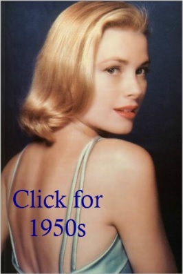

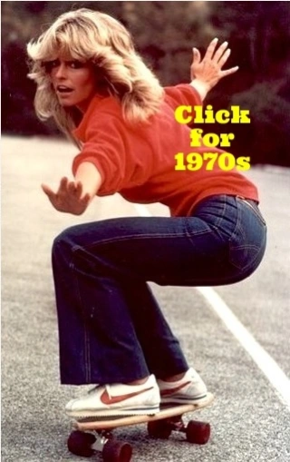
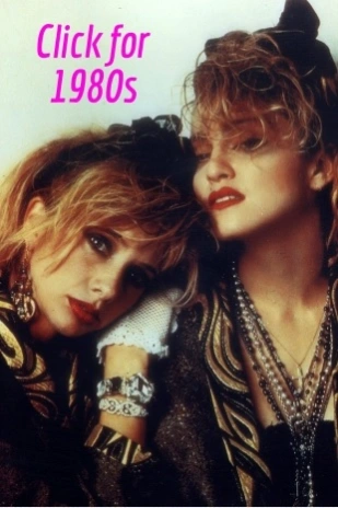

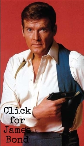


