Mapping the stars: The Great Bear (1992) ~ Simon Patterson

Going underground: detail of artist Simon Patterson’s wryly playful take on the iconic London Underground map featuring lines of film stars, comedians and philosophers instead of stations
You may not know it, but this blog has just celebrated its first birthday, so what more fitting moment than right now to better address one of its aims? That is, to provide you, dear readers, not merely with my musings and general scribblings on all things retro, but also on art that I like (I’ll have to come back to history and politics another day). In which case, today I’m taking a look at one of my all-time favourite artworks, namely The Great Bear.
Produced by the UK’s Turner Prize-shortlisted artist Simon Patterson in 1992 and to be found in London’s Tate Modern Gallery, it’s an amusing, off-kilter reworking of that design icon, the London Underground route map. Now, must admit, the London Underground, or the Tube as it’s affectionately known to, well, everyone, is something of a must with me. I’m not a railway or transport nut at all, don’t get the wrong idea, but something – or perhaps many things – about the Tube have always fascinated me.
Engineering-wise, given its size and the fact it was the world’s first underground railway, it’s mighty impressive (just check out Bank station – a subterranean labyrinth on an amazing scale beneath the City of London). Plus, unless you suffer from claustrophobia or it’s rush-hour, the Tube’s often fun to travel on – you get all demographics down there; the commuter, the tourist, the rich, the poor, the dullard, the eccentric etc. And, surely its most popular facet, its signage, logos and age-old art are works of art deco beauty.
The chief exponent of the Tube’s bold-coloured, smooth-edged and all-round pleasing-on-the-eye art is, of course, the Tube map itself. Designed by London Underground draftsman Harry Beck in 1931, the map is surely one of the world’s best known (see video clip at bottom). Its genius lies in the fact that unlike, say, the also world famous London A-Z map, it doesn’t realistically portray distances, but is a schematic diagram; for travellers on the underground network the topography is what’s immediately important, not necessarily the actual physical locations of the stations (travellers can check that out when they’ve got to where they want to and are above ground). The map is clean, simple, colourful, easy-to-use and unforgettable.

Constellation of connections: Simon Patterson’s The Great Bear – its title punningly riffs on the English translation of astronomy’s Ursa Major; click the image to see the full-size version
So this is, yes, where The Great Bear comes in. What’s so great about it? Well, it doesn’t just rework the already brilliant Tube map, but manages to transform it dramatically – in a most entertaining way. In this artwork, Patterson importantly doesn’t change any of the map’s design features at all (the Tube lines’ colours all remain the same, the circle icons representing the stations are all intact and the fonts are all unchanged); what he does is simply change the stations’ names. He does it Tube line-by-Tube line, throwing in a great deal of wit as he goes.
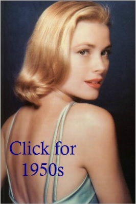
So, for example, the notorious north-to-south-running Northern line becomes ‘Film Actors’, the east-to-west-running Central line becomes ‘Louis’ (or French kings and other leaders/ players on the world stage) and the overground line becomes ‘Thirty Comedians’. This ensures that the iconic Tube station Tottenham Court Road becomes ‘Gina Lollobrigida’; Camden Town becomes ‘Peter Fonda’; Bank becomes ‘Zog I’ (of Albania); Stratford becomes ‘Napoleon’ and Brondesbury Park becomes ‘Spike Milligan’. But what about when different Tube lines intersect at different stations? Well, Patterson doesn’t let up – take West Hampstead, where the Jubilee line (‘Footballers’) and the overground line (‘Comedians’) meet; it becomes ‘Paul Gascoigne’. Neat, eh?
As with any artwork, though, there’s something more profound at work with The Great Bear than just giving the viewer a decent chuckle. By not just retaining the look and iconography but the exact detail of the Tube map, yet substituting the expected and often familiar station names for names of well-known figures from completely different realms of our experience, it creates a slightly jarring, even confusing effect. Although this effect may only be there for a few seconds until we figure out what’s going on and it becomes funny, it’s long enough to lodge in the brain and, thus, cleverly demonstrate how the everyday and the expected can be subverted – how peculiar it is when the entirely disparate (film actors, philosophers, engineers etc) are brought together in one setting where they shouldn’t be (the Tube map). It’s all about knocking us sideways and looking at the familiar through different eyes. It’s a smarty-pants artwork to the say the least, methinks.
Patterson hasn’t been alone in using the Tube map as a model for artistic expression – or, perhaps more correctly, others have been inspired by him and produced their own efforts. Most impressive among them may be Mark Ovenden’s World Metro Map (see below). Commissioned in 2005 by the London Transport Museum, where I believe it can still be bought, for the launch of his book Transit Maps of the World , the artwork imagines the Tube network connecting up not London but the entire world, with its major cities standing in for the stations.

It’s a small world: 2005’s World Metro Map; click the image to see the full-size version
A smiliar idea is artist Chris Gray’s Underground. This piece doesn’t use the exact typography of the Tube map, it’s more inspired by it, mapping the world in a Tube-like manner with major cities, again, picked out as stops on its different lines that roughly trace the globe’s continents. Gray has described Underground as such: “Humans have always made connections. This ability is one of the cornerstones of our success as a species. Underground explores various aspects of our world and how we associate with it.”
Taking a perhaps less expansive but no less lofty theme – that is, the works of the Bard and the connections between the different characters of his plays – is the Greater Shakespeare map. A recent publicity tool produced by Stratford-on-Avon’s world famous Royal Shakespeare Company (RSC), it’s a fun and very accessible PR exercise for their theatrical efforts and the genius of the great man himself; the contours and colours of its lines and the font of its stations/ character names unquestionably Tube map-esque.
At the end of the day, I’ll admit The Great Bear may not genuinely be as impressive as its namesake, the constellation Ursa Major (another collection of ‘stars’), but I do hope I’ve managed to impress on you its marvellous merits. Who knows, one or two of you out there may even now decide, like I did several years ago, to hang a copy of it on your wall so you can gaze at it at your pleasure. After all, thanks to cloud-cover, you can’t gaze at the real ‘Great Bear’ any time you want – and you certainly can’t do it in the warmth of your own home either. So hooray for freely available art, eh? 
Trackbacks
- The 12 Wines of Christmas — Day 3: The must-have wine map | Christmas Ornaments Costumes
- Going (London) Underground: happy 150th birthday to The Tube « George's Journal
- Education homework help - Quality Homework Answers
- Week 1 journal due in 16 hours - 101papers
- Week 1 journal due in 16 hours - Graduate Writing
- Week 1 journal due in 16 hours - 111papers.com
- Week 1 journal due in 16 hours - Homeworkninjas
- Week 1 journal due in 16 hours - Homework & Essays
- Week 1 journal due in 16 hours - Elite Custom Writings
- Week 1 Journal Due In 16 Hours | Best Quality Essays
- Week 1 Journal due in 16 hours : Course Help Online - Course Help Online
- Week 1 journal due in 16 hours – MyEssay.help
- WEEK 1 JOURNAL DUE IN 16 HOURS - Writer Bay
- Week 1 Journal Due In 16 Hours - Assignment Help | My Essay Homework
- Week 1 journal due in 16 hours - Essay Hub
- Week 1 journal due in 16 hours - Trusted Graduates
- Week 1 Journal due in 16 hours - Cramful
- Week 1 Journal Due In 16 Hours – educationaly.info
- Week 1 Journal Due In 16 Hours - Special Pages
- “What makes a hero? – Homeworkmarket
- read the about the journey of Odysseus, we might consider our own journeys. - Discount Writers
- Week 1 journal due in 16 hours - STUDYPROESSAY.COM
- Week 1 Journal Due In 16 Hours | Assignment Gate
- read the about the journey of Odysseus, we might consider our own journeys. - Focal Writers
- Week 1 journal due in 16 hours - My Essay Nerd
- Assessment of Myth Journal Assignment - SUPPORT PROFESSOR
- Week 1 journal due in 16 hours - Research Essay Pro
- Week 1 journal due in 16 hours - Assignments Help US
- Week 1 journal due in 16 hours - Yolo Papers
- Week 1 journal due in 16 hours – The Custom Essays


an interesting article george. Why was it called the Great Bear?
Glad you like it, bob.
As to your question, the answer’s sort of there in the post – the name is the pun on the English translation of Ursa Major (which can be described, as can Patterson’s artwork, as a constellation of ‘stars’)…
Please does anyone know where I’d buy a print of the Simon Patterson Tube Map? I’ve seen one somewhere, but can’t find out!
Have you tried looking on the ‘Net, Gavin? This seems a decent place to start…
http://bit.ly/nLvloW
Thanks for your comment…! 🙂