Looking good: a roster of rare movie posters
Posters. At their best, they can serve as both a canny advertising tool and a satisfying work of art. And this collection, a score of, methinks, some of the very best lesser known film posters from the ’60s, ’70s and ’80s, is no exception. Among them are unusual but more than worthwhile efforts for big-name flicks, and some outstanding ones for less well recalled movies. Either way, for me, they all deserve posting here at George’s Journal.
Don’t forget to CLICK on the images for full size – and on the links for more information.
~~~
You Only Live Twice (1967)/ for USA market
(Above)
First up, a poster from a Bond film. And why not? It’s hard to think of any 007 escapade that hasn’t been promoted by a good one. The above one’s very similar in style, tag-line and use of font to its far more famous sister poster that features Connery in the autogyro Little Nellie amid an air battle with pesky SPECTRE helicopters. However, this ‘un’s surely just as good, its alternative design featuring Bond inside the villain’s volcanic lair; the hero bedecked in a dinner suit and at that ridculous angle, with the deep red colour behind him, all lending the thing a somewhat bizarre and sinister feel. The result? An exciting poster that can’t fail to entice one to see its film.
~~~
It’s A Mad, Mad, Mad World (1963)/ for USA market
Perfectly capturing the spirit of its madcap caper of a movie, this effort is a classic – and all too rare – cartoon-based film poster. Truth be told, I’ve never been a huge fan of the flick, I’m sure I’ve only seen it in snatches, but I’ve always greatly admired this artwork. Seemingly featuring every one of its cacophany of a cast (check out all those guest stars!) as figures rushing after a suitcase of money – as in the movie – notice that every one of them, including Spencer Tracy at the front there, have cartoonishly slightly over-sized heads. In fact, the whole effect isn’t dissimilar to trying to find film stars in a Where’s Wally? landscape. Clever, indeed.
~~~
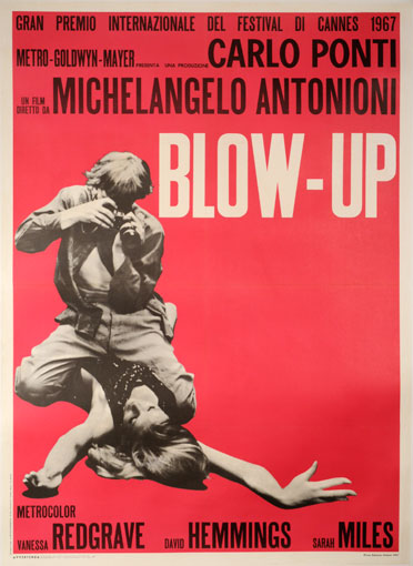
Blow Up (1966)/ for Italian market
An unforgettable, iconic image on a bold, bright red background. This poster’s simplicity is its genius – and it’s so genius it almost aches. Blow Up, the legendary Antonioni’s only foray into UK filmmaking, is an undeservedly still under-seen classic capsule of the Swinging Sixties and, most specifically, the London fashion scene of that era. And this poster perfectly encapsulates – and therefore sells – all that the film is. The design also came out on a yellow and green background, but the red is, probably for obvious reasons, the best.
Further reading:
http://doubleonothing.wordpress.com/2010/05/09/blowup-antonionis-seminal-60s-film-is-no-let-down/
~~~
Fantastic Voyage (1966)/ for USA market
And here we have what may be, to my mind, the greatest ever ‘teaser’ poster. Fantastic Voyage is a rather stodgy sci-fi flick featuring a Jules Verne-like voyage inside the human body (the ’80s adventure Innerspace was its remake). And, in their infinite wisdom, how did 20th Century Fox announce to – let’s be honest – male moviegoers that this film was ‘coming soon’? That’s right, they slapped up a picture of an ‘implied’ nude Raquel Welch (one of the film’s stars, at least) and called it a film poster. A pin-up teasing on a teaser poster? Genius. If that wouldn’t get the punters in, surely nothing would. One interesting sidenote, though, is that that this poster clearly displays how the social mores of the States – and, indeed, elsewhere – were definitely relaxing by the mid-’60s. And then some…
~~~
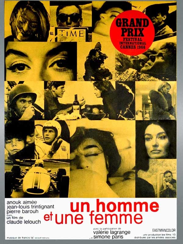
Un Homme Et Une Femme (A Man And A Woman) (1966)/ for French market
A lesson in ’60s European cool here. This features the exact same idea of filling a canvas with on-set stills of different sizes and shapes that was used for a major poster of the great, similarly French/ New Wave-made À Bout de Souffle (Breathless), released six years earlier. However, despite the same design and the latter flick’s status as an unadulterated classic, I must admit I prefer this poster. There’s something so unquestionably cool about it. Two trendy film stars cast as beautiful lovers – one of whom’s a racing driver – caught in sepia moments in time. It’s very French, it’s very nouvelle vague, and it’s very cool.
~~~
Camelot (1967)/ for USA market
For me, Warners’ cinematic adaptation of Camelot is a highly underrated movie musical – it’s right up there with the likes of Oliver! and Mary Poppins – but many seem to disagree with me. What surely isn’t up for question, though, is that its poster is a stonker. Released, as it was, right slap-bang in the middle of the ‘free love’ age, the film’s stylings, tones and costumes take influence from the times, and, reflecting this, the poster does too. In fact, you could say it goes further. It’s not quite psychedelic, but its a whirlygig of colour and movement and, at its focal point, Vanessa Redgrave’s Guinevere is represented as a hippie angel with free-flowing, wild red hair – both in the main image and the smaller one in the foreground. Indeed, if a ’60s makeover of King Arthur’s court – featuring David Hemmings as a suitably impish but cool Mordred – appeals to you, then I heartily recommend this flick.
~~~
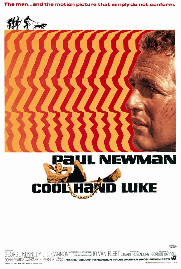
Cool Hand Luke (1967)/ for USA market
By way of contrast with Camelot‘s poster, this one’s artwork is positively gaudy – indeed, there’s something almost ’70s about the repeated cut-out silhouette shape in red and cream it deploys. More funky than hippie, certainly. But it’s confident, assertive, brassy and cool as hell, very much in keeping with Paul Newman’s Luke himself, a one-man machine of defiance on a chain-gang in America’s Deep South. As the tag-line reads, it simply screams exhilarating non-conformity.
~~~
The Fox (1967)/ for USA market
A curate’s egg, this one. The film is a generally forgotten adaptation of a D H Lawrence novella written in 1923, but you’ll surely remember the poster from the second you clap eyes on it. Such a simple idea too – reflect the movie’s plot with its sapphic overtones by interlocking two women’s heads, and suggest the man involved with them both – and the dangerous ménage à trois that creates – by the axe he holds. Produced as this poster was in 1967, note the hint of psychedelic design in the right-hand head’s flowing locks.
~~~
If…. (1968)/ for UK market
A terrific example of an image and tag-line working in perfect harmony on a poster, this one is an all-time classic of UK cinema – and the film certainly ain’t no slouch either. Also, a closer look at the grenade will reveal its individual sections are cleverly made up stills from the film (a la Un Homme Et Une Femme above), while the classy, yet big, bold two-worded title is a terrific use of typeface. This poster is deliberately but subtly disturbing – rebellion was in the air in the late ’60s and that’s exactly what the intelligent If…. was all about.
~~~
The Thomas Crown Affair (1968)/ for USA market
Surely you’d have to be rather an ignorant retro enthusiast not to be aware of the original Thomas Crown Affair? Steve McQueen; Faye Dunaway’s super-long eyelashes; The Windmills Of My Mind etc. But have you seen this poster of said flick before? Perhaps you have, but perhaps you haven’t. By perfectly mirroring what it’s supposed to promote, it too is a visual tour de force. Effortlessly cool and hugely sexy (look at how Dunaway is almost biting McQueen’s lip there), it terrifically reflects the film’s memorable split-screen technique and, in doing so, like the film again, in each smaller box it makes use of close-ups of the main image and focuses almost indiscriminately but appealingly on anatomical details. It even coolly rocks that shocking pink.
~~~
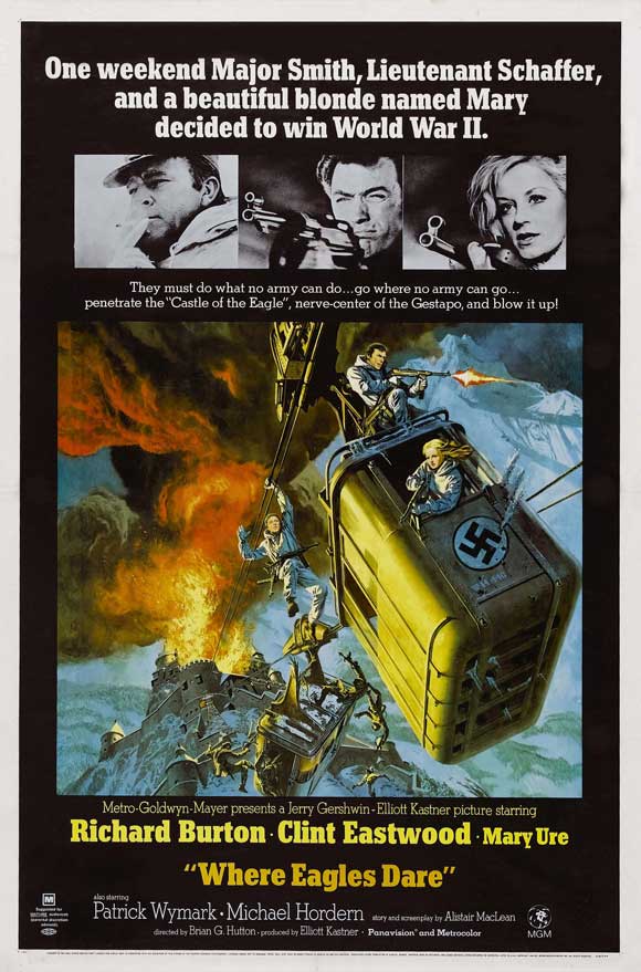
Where Eagles Dare (1968)/ for USA market
So what’s so great about this poster then, I hear you all cry? Well, because just like the flick from which it comes, its greatness lies in its utter ridiculousness. The design of the image is very Bond film poster- like, and not a million miles away from the style adopted for posters for the likes of The Guns Of Navarone (1960), but none of those such posters would claim that two men and one woman were capable of ‘winning World War II’, especially because they’d just decided to! It’s silly, grandiose and a load of nonsense, but it’s nicely designed, very engaging and a whole lot of fun.
~~~
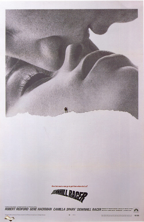
Downhill Racer (1969)/ for USA market
An example, if ever there were one, of a poster that’s better than the movie (trust me, Robert Redford looks neither cool or sexy in skiing garb), this effort’s also a great example of how cutting edge, manipulated images to be found in magazine ads in the ’60s, by the end of the decade, began to be employed by Hollywood for their big flicks. There’s little pretence here about trying to fool the viewer into thinking this is a ‘natural’ image crafted by its designer; anyone who takes a glance at it ‘can see the joins’, as it were, where the scissors have been got out and individual images moved around and put in place. Yet the effect is damn cool – even if , when you break it down, it’s all a bit hokey (the tagline reads: ‘How fast must a man go to get from where he’s at?’), and yet that hokeyness just adds to its charm for me. Think the movie bombed, mind.
~~~
Hello, Dolly! (1969)/ for USA market
As the poster reveals, Michael Crawford of Some Mothers Do ‘Ave ‘Em fame was in Hello, Dolly!, but there’s nothing Frank Spencer-esque about its poster. While I’m unlikely to send flowers anymore – or, to be precise, ever – to Ms Streisand for her musicals, this one’s artwork is indeed top stuff. Again, there’s more than a hint of psychedelia – in fact, the copious foliage of Barb’s bonnet is blooming with it – and the bright colours are immediately appealing. But it’s greatness surely lies in the fact the oval-shaped centre, containing all the colour and surrounded by the lively title in bold typeface, is set on a completely white background. There’s something very modernist to it all, seems to me, and something very effective too.
~~~
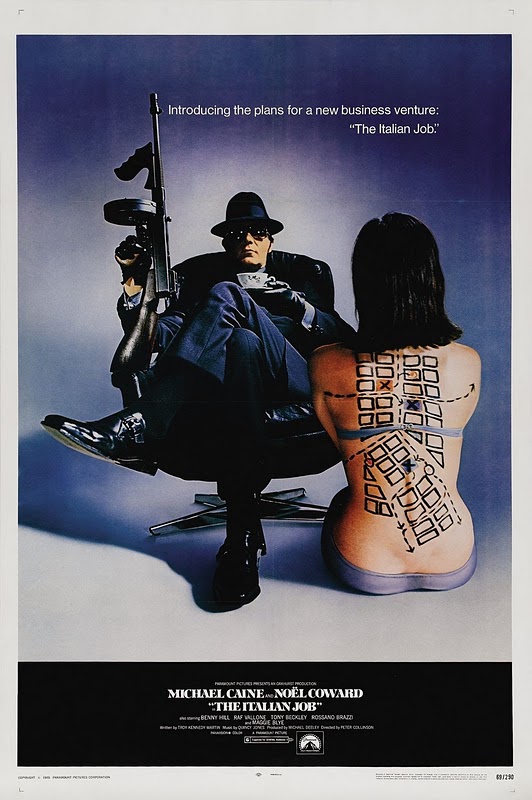
The Italian Job (1969)/ for USA market
In all fairness, if a film poster is supposed to sell its product by smartly and – ideally – subconsciously sowing the seeds in someone’s mind of what it’ll be like, then this poster pretty much fails. Instead of suggesting to US moviegoers that The Italian Job was a hip, sunny, very British crime caper, it surely put in their minds a stylish, heavy mafia-related heist thriller. All right, the movie’s a bit like that latter description, but that’s not how anyone would choose to describe it, is it? So the big question is why have I included this poster in this list then? Because it’s cool as hell, that’s why. It’s one of those products that makes you wonder whether any decade managed to produce anything remotely as cool as anything that came out of the ’60s. Sharp, sleek, witty and stylish, it really shouldn’t be a film poster – hell, it should be a ’60s Pan paperback cover. It’s art and that’s that.
~~~
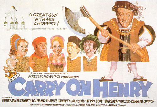
Carry On Henry (1971)/ for UK market
All right, yes, while this one doesn’t exactly deserve to be in this company for its artistic merit, it surely makes up for it with its fun and ebullience. And for that outstanding tag-line. Plus, there’s something appealing – and fittingly childishly comic – about the characters with their over-sized heads again (a staple with Carry On posters, in fact). If anything, they’re reminiscent of toby jugs – like the Carry On films themselves, another great British institution.
~~~
The Candidate (1972)/ for USA market
The product of an era of intense politicial cynicism, nay disillusionment (what with McGovern’s flattening by Nixon and the subsequent Watergate scandal), The Candidate featured Robert Redford (again) as a no-hoper running for office merely to espouse on a platform, but becoming corrupted once he had a shot at winning. It’s a flick lighter than, say, All The President’s Men, but has bite nonetheless. But what about the poster? Well, all this is wonderfully suggested by Redford blowing a bubble in front of the Stars and Stripes – creating both a devil-may-care attitude and a tone totally at odds with the earnestness and augustness with which politics is supposed to be infused. A very ’70s film poster and an unforgettable image. The line at the bottom tops it off nicely, indeed.
~~~
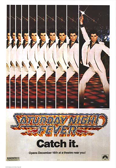
Saturday Night Fever (1977)/ for USA market
While hinting at none of the grit, edge and darkness that makes The ‘Fever the decent film it is under all the disco, this is nonetheless, to my mind, a poster that’s an absolutely doozie. Why? Because with the iconic shining, metallic title typeface, the sharp as hell tagline and the mirror-like half-repeat of the unforgettable main image, it sizzles with energy and electricity. In short, back in ’77 it would have jumped out at you and grabbed you by the balls. Nowadays, yes, it may well seemd damned tasteless, but surely its effectiveness as simply a poster advertising a film is unquestionable.
~~~
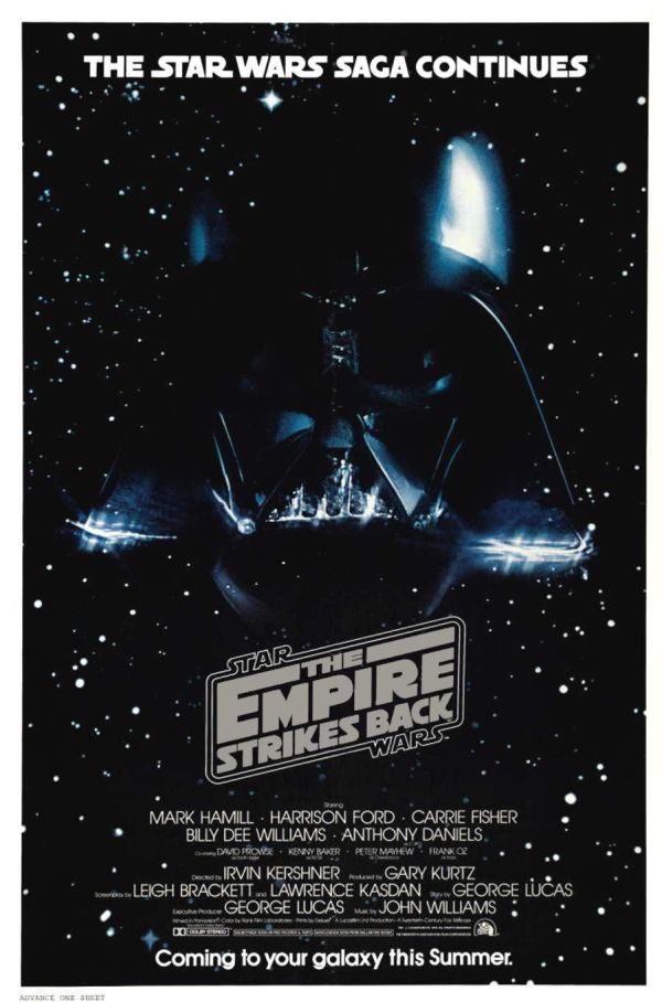
The Empire Strikes Back (1980)/ for USA market
There are, of course, many, many great posters produced for the original Star Wars trilogy, but staying true to the ethos of this list, I’ve picked here a lesser known – perhaps the least known – one. What I love about it is it’s simplicity. For me, it’s a perfect teaser poster. Even three years on from the original Star Wars, you’d surely be forgiven for wondering how they’d be able to equal – let alone top – that, but of course they did with Empire – and this poster may just have given you an inkling they were going to. The message is plain, the Rebels’ cause is not over; the Empire is striking back. Not only are we told that, but we’re presented with the forbidding helmet of Darth Vader set against a pitch black background of space (albeit with some stars). The stark message hits you like a sledgehammer – just as well then that loveable, brilliant old Yoda the Muppet popped up in the flick to soothe adults’ fears and delight the kiddies.
~~~
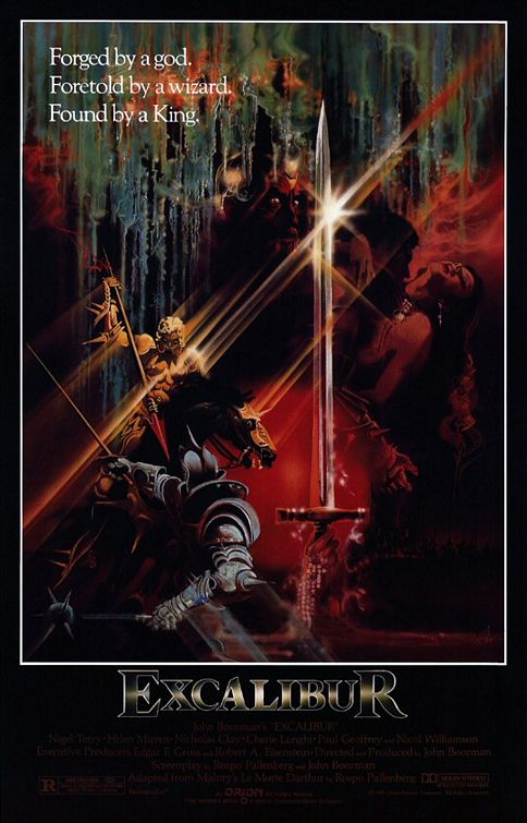
Excalibur (1981)/ for USA market
Make no mistake, Excalibur is an ambitious film, and its poster ably hints at that. Suggested in this beautiful artwork , with its light beams created by swords and glittering armour, dramatic poses and expressions and magical-looking creatures is all the luxurious, melodramatic and shimmering beauty on show in the movie itself. Moreover, the glossy texture of the image even seems to reference the enigmatic nature of the film’s tone – never quite attainable, much like myths (and especially those of King Arthur and Camelot) themselves.
~~~
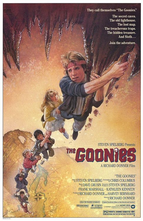
The Goonies (1985)/ for USA market
A light, fun poster to finish on then – and one that could only have come out of the ’80s. Unashamedly inspired by the fantasy heroism-themed artwork of the Indiana Jones posters (and indeed created by the artist behind many of those classics, Drew Struzan), this effort for The Goonies struck a big chord with me back in the day and I’m surprised you don’t see it more – I would have though the fun, campy image would have proved endurably memorable (after all, everyone remembers the Crocodile Dundee poster in which Paul Hogan bends back the skyscrapers of New York – and that’s a very similar ‘visual gag’ in tone and style to this one’s). Anyway, this poster for me is tops, referring perfectly as it does to the adventure, action, fantasy and mild peril throughout a flick that’s proved inescapable entertainment for kids of the ’80s – at all ages.
So, folks, thanks for looking – and reading my reporting on posters of years past for posterity. 
Trackbacks
- Still looking good: another roster of rare movie posters « George's Journal
- Hipsters, swingers, spies and easy riders: the 10 ultimate ’60s flicks « George's Journal
- Playlist: Listen, my friends! ~ August 2012 « George's Journal
- 30 years ago this year ~ that was when… | George's Journal
- Playlist: Listen, my friends ~ January 2014 | George's Journal




















Great article! I love these classic posters, Georgio!
For those after their own slice of cinema art, check out Limelight on the King’s Road.
http://www.limelightmovieart.com/
They stock original, vintage movie posters from all over the World. Definitely worth a look.
Also, whilst you’re over at my blog looking at the BlowUp article, why not check out my article on Robert McGinnis who did many of the Bond posters, as well as Breakfast At Tiffany’s.
http://doubleonothing.wordpress.com/2010/02/11/robert-mcginnis-poster-boy-for-the-1960s-generation-of-film-makers/
We really should go poster shopping one of these days.
Dubs.
I do have a few posters, including prints of the classic Butch Cassidy And The Sundance Kid one and an Italian Ocean’s Eleven poster, but yes, poster shopping sounds good. Fancied getting a Back To The Future poster for a while.
Will have to give your Robert McGuinnis article a read – sounds good…! 🙂
yeh interesting article – i think there is a cult following of these posters, they have become quite collectible – there are a few shops in Brighton that do. I really like the excalibur and fox ones..lots of nude ladies, poor exploited women.
Super-Duper site! I am enjoying it! keep posting good contents � taking you feeds also. thank you
Fascinated by the Camelot poster – not quite psychedlic, as you say, and with definite touches of Art Nouveau.
What a feast for the eyes! My favorite out of these is the poster for “Blow Up.” Although “Un Homme Et Une Femme” is a close second. Now I want to go see all of these films just because of their posters. If I had the dough, my room would be covered in old school posters like these.
Thanks, The Mental Secretary. Re your point about having the dough – yep, I’m totally with you on that one…! 🙂