1863 and all that: getting shirty ~ the 15 greatest ever England kits
![]()
![]()
![]()
![]()
![]()
![]()
![]()
![]()
![]()
![]()
![]()
![]()
![]()
![]()

![]()
![]()
![]()
![]()
![]()
![]()
![]()
![]()
![]()
![]()
![]()
![]()
![]()
![]()
Looking a vermilion dollars: the 1966 World Cup-winning England team show off the Jules Rimet trophy (held by captain Bobby Moore, centre) in the national side’s best recalled kit
Yes, that’s right, folks, if you weren’t already aware (admittedly, if you’re from these isles and at all follow the national game, it’d be pretty darn unlikely you weren’t), this summer marks the 150th anniversary of the English Football Association – and, ergo, the England football team. In which case, because it likes to, this sunny season this very blog will be celebrating this jumpers-and-goalposts-related milestone by devoting the odd post to some true highs (as opposed to, yes, the many lows) there’s been for England’s international side over the decades, starting with this offering you’ve just started reading.
Yes, again, surely only if you make it your business to ignore everything football-esque, would you be unaware that England have – for the umpteenth time – just changed their kits (home and away) and specially so for this their anniversary year; for what it’s worth, while methinks the new ‘home’ effort is flawed, it’s not as bad as all that, while the ‘away’ one ain’t bad at all. And, fittingly enough then, well, depending on your view, this blog focuses on the 15 – as it’s the 15oth anniversary – best kits our chaps have performed and, erm, not performed in. There may’ve always been three lions on the chest, but the rest of their togs have been through several different incarnations, colours and styles – so eat your heart out Gok, because here it is, England’s sartorial soccer rundown…
.
CLICK on the titles for video clips and on the images for full-size
.
.
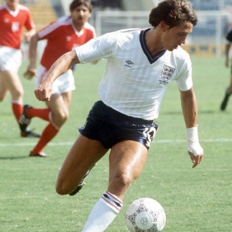
Tournament: World Cup 1982 (Spain)
Manufacturer: Admiral
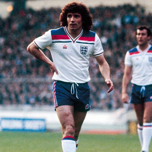
The good: Easily distinguishable from every other England kit, this better-of-the-two Admiral efforts boasted a shirt with a dynamic and bold, above-the-chest big blue, smaller red and thin blue tri-bar colour-splash.
The bad: Those unmissable red and blue bars were inspired by the UK’s Union Flag. But wait a tick, isn’t England’s flag that of St. George, er, featuring a red cross on a white background? In the early ’80s when unfurling Union Jacks was sadly even more sensitive than today, this design maybe wasn’t the smartest move.
The ugly: Again, that tri-bar broken by that v-neck is an acquired taste (the font used for the red numbers on the back’s a bit cack too). Unquestionably, this is the Marmite of England kits.
That was when: Kevin Keegan’s perm (and Kevin Keegan) always seemed to play for England (unless it was World Cup ’82, that is) – the David Beckham-esque shouldn’t-he-have-actually-been-better-than-he-was? superstar of England lore. Ouch!
.
.
14. Home goalkeeper kit (1990-91)
Tournament: World Cup 1990 (Italy)
Manufacturer: Umbro

The good: The only kit worn by an England numero uno to grace this list, this one’s inclusion may have as much to do with my ever nostalgic recollection of Italia ’90 and England’s post-1966 high showing therein as anything else. Still, as ’80s/ ’90s man-between-the-sticks outfits go, it’s a simple, dignified effort in classic England goalkeeper yellow and black (cf. this psychedelic monstrosity from ’95-’96 and this even crazier ‘away’ alternative from the same era – “Matron, take them away!”).
The bad: The black collar sticking out over the top of the hoop-neck’s not fantastic, admittedly.
The ugly: Some may suggest the rubber pads on the shoulders here (why are they there? There aren’t even any on the elbows? Weird). Me, though, I just think they add a little eccentric, if appealingly naff, charm to the shirt.
That was when: The legend that was Shilts was called on to try and keep England in the World Cup when he faced Matthäus, Brehme and co. in our first ever penalty shootout; he didn’t save one, but guessing right each time, impressively got damn close to all four that beat him.
.
.
Tournament: World Cup 2006 (Germany)
Manufacturer: Umbro
The good: Seeming to reflect the swaggering (but eventually doomed) Beckham-brand-driven England of the 2006 World Cup in Germany, this was the shirt with that ‘look at me!’ pointy-ending red cross (referencing St. George’s flag) on the right shoulder. It’s maybe not the most fondly recalled of England efforts, but cuts a bit of a dash in the fashion stakes, while also boasting not a little elegance.
The bad: Call me a purist, but unless the colour co-ordination of an England kit is genuinely excellent, I always like a white shirt, navy blue shorts, white socks and red numbering and lettering on the back of the shirt. This one continued the unconventional early to mid-’00s habit of making the numbers black or navy blue (which we’ve unnecessarily gone back to with the present Nike curtain-raiser). It may occur here because a red font would detract from the red shoulder-cross, I suppose, but it’s something that always niggles…
The ugly: Never been crazy about that collar, if I’m being honest. The red-striped-shoulder is what this kit’s all about; it doesn’t need a collared neck to over-busy the shirt (even just a little bit). A simple v- or hoop-neck would’ve been fine.
That was when: Peter Crouch scored by pulling a Trinidad and Tobagon’s dreadlocks and Frank Lampard totted up more shots on goal than anyone else in the entire tournament (without hitting the back of the net once) – at least the WAGs got some shopping done in Baden-Baden though, eh?
.
.
Tournament: Euro 2004 (Portugal)
Manufacturer: Umbro

The good: Another bold effort this one, when all’s said and done. And that’s because of that wide (although ending in a point) red stripe running down either sleeve from the neck. It’s actually a hint of the St. George’s flag again, given it begins as a bar across the back of the shirt (above the player’s name), from the centre of which a short, narrow red line runs up and under the collar. Clever. And the similar red piping down the neck running into the top of the centrally located England badge is a nice sartorial touch indeed, to my mind.
The bad: Again, there are collar issues (a recurring theme among England shirts) – while the red piping at the neck is nice stuff, the white collar itself against the red piping, that’s also down the arms of course, doesn’t altogether look right. Far from a disaster at all, but maybe a navy blue collar may have been a better bet?
The ugly: The first kit on which a star denoting the nation’s sole World Cup triumph appeared, this one may be, but where was it plonked? Two thirds of the way down the shirt sleeve. Er, right.
That was when: Rooney terrorised the French, then ran like a whippet before unleashing two crackers against a decent Croatia to send England hurtling into the quarter finals of Euro 2004. Who knows, he may well be a world beater one day, but never has he looked more like one than he did that balmy Portuguese summer.
.
.
Tournament: World Cup 1986 (Mexico)
Manufacturer: Umbro
The good: England kits are rarely better than when they’re unfussy things. And this mid-’80s offering is a fine example. With its quiet v-neck made up of two navy blue ‘v’s either side of a thin reddish ‘v’ and that slight pin stripe, its shirt is reminiscent of many English football shirts of its era (think the Dalglish-associated, pin-striped, Candy sponsored Liverpool one), but it’s damned elegant too. The Umbro diamond is unusually small as well, which, don’t doubt it, is also credit-column-worthy.
The bad: Compared to others, one may say this kit’s a bit bland. And a tiny quibble – the squad numbers on the shorts are not in the same font as the squad numbers on the back of the shirt. Yup, said it was a tiny quibble. The shirt numbers are in big, bold, bright red, though. Another tick there then.
The ugly: As implied above, this kit doesn’t really do ‘ugly’.
That was when: Gary The Lineker banged in a hat-trick against Poland and six in total for the tournament (which made him Mexico ’86‘s Golden Boot winner, despite having only netted in three matches), before it all came crashing down against Maradona in that fateful quarter final.
.
.
Tournament: World Cup 1998 (France)
Manufacturer: Umbro

The good: Some England kits are just cool. They have that usually oh-so elusive ‘x-factor’. This one, for me at least, is a prime example. Actually rarely worn in the era of the memorable late ’90s white-red-and-blue-rainbow-like home kit, it seemingly appeared out of nowhere to star alongside Beckham bending in the (second?) most important free-kick of his career against the admittedly unmighty Colombia in a win-at-all-costs France ’98 group game. That St. George’s flag inflection on the deliciously burgundy-toned shirt and that slanting font for the numbers and letters… together they’re just cool as hell.
The bad: The collar. Again. It’d be fine if it just ended in a point, but that crossover-material effect ending in a flat take on a v-neck is unnecessary and doesn’t really work. Shame.
The ugly: Excusing the v-neck-ish eyesore, there’s nothing ugly about this kit.
That was when: Beckham announced himself on the World Cup stage (see above)… before getting sent off against the Argies in the next game. Silly boy.
.
.
Tournament: N/A
Manufacturer: Umbro

The good: In hindsight, time can be cruel to good football kits (work with me here), for had this number featured in a tournament, nay, one in which England had actually performed well, then it would probably be recalled better and, admittedly, higher up this list. All the same, it’s fine a looking effort, fusing the radical (no red whatsoever, while the shorts, numbers and letters are in one of the lightest blues ever to star on England garb) with the old-school (the v-neck-esque collar ends in a would-be buttoned-up-halfway-down-shirt front – but without the buttons – that echoes pre-’60s England shirts). And the whole thing works well and looks very nice and tidy.
The bad: Design-wise, there’s little to criticise; otherwise? Well, it’s hard actually to recall a specific match when our nation’s footballers wore it. Hmmm.
The ugly: The shoulder area on the shirt’s back features a multitude of multi-coloured crosses (supposedly symbolising both the St. George’s flag and the fact that today’s England is a very multi-racial place). A nice idea, which was apparently the brainchild of one-time Factory Records in-house album cover designer Peter Saville – if an idea that may have better remained just that.
That was when: Er, yes, when exactly was that again?
.
.
Tournament: World Cup 1998 (France)
Manufacturer: Umbro

The good: The white-red-and-blue-rainbow kit mentioned above, this one was quite radical back in the day (unlike nowadays when ‘radical’ England kits seem to tumble one after another off the Umbro/ Nike production line), for it was the first to feature just as much – if not more – red as blue since the early ’80s home kit (no. 15 on this list). Not only pleasing on the eye (the curved red and blue bars down the shirt’s sides and echoing red and white bars on the shorts – although bold as brass – are well designed), it also seemed to mirror the confident, colourful era the national team enjoyed during its run (post-Euro ’96 and up to the end of France ’98, which saw the dying embers of Gazza’s international career, the consolidation of Shearer, Sheringham and Ince’s and the start for Beckham, Owen and Scholes). Happy days, indeed then.
The bad: This shirt may wisely continue the use of the ‘American football style’ number and letters font that Umbro employed on many of its ’90s soccer shirts, but annoyingly the numbers are strangely narrow. Why? For such a bold shirt design, just go with a full bold font, surely.
The ugly: Oh yes, we’re back to collar issues. And it’s a weird one this time; like this kit’s away offering, the neck doesn’t end in a ‘v-point’ as it would be expected to, but in a flat horizontal line, ensuring the shirt unnaturally crumples up a little around it. Plus, the neck features a square St. George’s flag label and a round St. George’s flag button – both unnecessary and a bit naff.
That was when: Yup, when England mastered a World Cup qualifying campaign for the first time in nearly a decade by claiming a terrific away draw against Italy (in which they outplayed them), then won a (sort of) trophy by besting France, Brazil and Italy again in a year-before-warm-up friendly tournament, only not to scale such dizzy heights in the World Cup itself. Ah well.
.
.
Tournament: World Cup 2010 (South Africa)
Manufacturer: Umbro

The good: Make no mistake, this effort is by far and away the most radical England home kit of modern times. Really? Yes, because for the first time ever, the shorts were chosen to match the same colour as the shirt. Sure, England had worn an all-white home kit before (often in tournaments too; against Brazil in Mexico ’70 and Argentina in France ’98), but those occasions featured ‘changed’ shorts to avoid colour clashes with the opposition. In the run-up to this kit’s introduction though, when wearing their home kits, the national side seemed to have flirted fairly often with wearing white shorts, as opposed to the usual navy blue ones, so presumably Umbro and The FA eventually just decided to go the whole hog. And, quite frankly, it worked extremely well. The overall design with the red numbers and letters (in a beautiful, old-school font) is so simple, elegant, smart and retro that, dare I say it, it’s rather gorgeous.
The bad: To buy the shirt on its own without the shorts, as most fans would have done, would have required forking out an astronomical amount for a garment that’s little more than a white polo shirt.
The ugly: There is nothing ugly about this kit. Period.
That was when: England qualified in fine style for the 2010 World Cup and then, wearing this kit twice in their four games that tournament (they inexplicably wore an all-red alternative for the other two fixtures), were insufferably awful.
.
.
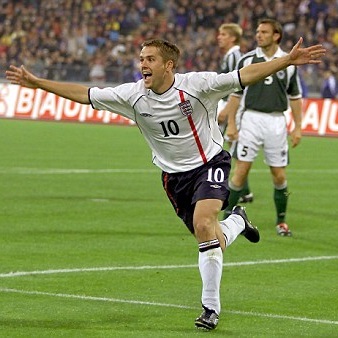
Tournament: World Cup 2002 (Japan/ South Korea)
Manufacturer: Umbro

The good: The 2002 World Cup in Japan/ South Korea was an odd beast. I’ve nothing against South East Asia at all (never been there, so wouldn’t dream of being so presumptious), but compared to other WCs, there seemed to be something clinical, above-it-all, almost cold about this one – and it did feel like its setting, with all those clean, futuristic stadia, monorails and underground train systems constantly on show had a lot to do with it. Oddly too, this was a tournament where almost all the usual suspects either weren’t there (Holland) or conspired to totally mess up their shot at success relatively early on (France, Argentina, Italy and, as ever back then, Spain). Collectively, this had two consequences: for once England looked a good bet for at least a semi-final place and, in such a ‘stylish’ football environment, their stylish football kits looked eccerin’ brilliant. First up is their away effort. Making marvellous use of burgundy again, it was a simple, subtle thing of beauty, with its understated v-neck (and a smart St. George’s flag reference on back of the neck) and an elegant font for the numbers and letters, it shone all too briefly, just as England ultimately did this tourney.
The bad: Not a criticism of the kit design per se, but it never really seemed to catch fire with the great unwashed England fans – maybe it just looked too good?
The ugly: Tell me I’m wrong, but I can’t spot one ugly thing about this effort.
That was when: A mohican-sporting Beckham banged in his redeeming penalty against Argentina, ‘inspiring’ the rest of the team to defend their way to victory and (following a win against Denmark in the opening knockout match) cruised through to the quarters where they went out with a whimper against a no-need-to-get-out-of-second-gear Brazil. Ho-hum.
.
.
Tournament: World Cup 2002 (Japan/ South Korea)
Manufacturer: Umbro
The good: The second of the two excellent kits England wore at the 2002 World Cup (and throughout the qualifying campaign that led up to it) was of course this little number, the unforgettable home kit that opened the Beckham/ Owen/ Gerrard-driven era ‘masterminded’ by super-cool Swede Sven-Goran Erikssen. Just like its away alternative, it was simple, subtle and elegant to a tee, with that St. Georg’e flag-suggesting vertical stripe down the left side of the front and passing behind the ‘Three Lions’ badge a highly effective nod to unquestionable, yet perfectly realised style on an England shirt. Make no mistake, dressed in this effort, England were easily the best looking side at the 2002 World Cup – even with lumbering lofty Emile Heskey up front.
The bad: As noted above, never been crazy about the ’00s England shirt trend that was numbers and names in navy blue/ black instead of the classic red. And, given this is an otherwise ‘classic’ looking kit (and because it started this trend), maybe this has to be a mark against it. Maybe.
The ugly: The ‘torso-defining’ piping that separates the rest of the shirt front from the shoulders and the arms is, if you’re being (hyper-) critical a bit ugly – the away kit also boasts this feature, but given that shirt’s in red it’s less noticeable. But we’re really clutching at straws here.
That was when: Owen grabbed a hat-trick, catapulting England to an unprecedented, nay surreal 5-1 counter-attack-tastic demolition of Germany in Munich. Pity then he and the rest of the ‘Young Lions’ didn’t have a ‘Plan B’ when it came to the real crunch against Brazil.
.
.
Tournaments: World Cup 1990 (Italy), Euro ’92 (Sweden)
Manufacturer: Umbro


The good: As I inferred above, one tends to recall an England kit rather positively when the fellers actually do well in a tournament while wearing it. And, for many England fans out there, this effort probably is the epitome of that statement; it’ll be forever identified with Gazza’s brilliance, Lineker’s penalties against Cameroon, Platt’s swivelling volley and Waddle’s awful mullet – in short, with that glorious footballing summer that was Italia ’90 and England’s (near) world-beating exploits therein. But, truth be told, even as a mere 10-year-old as I was at the time, I loved this kit from the moment I first saw it. With its featuring that (with hindsight, perhaps rather shameless) Umbro diamond-toting design, not least in terms of the water-marking on the shirt, smart collar and red, bold ‘American football style’ numbers on the back, it was more dynamic and somehow more serious and thus more grown-up than England’s immediately previous kit; almost a statement of intent of the side this time round – their last possible chance under the tutelage of Uncle Bobby Robson to (more or less) go the distance in a tournament and really fulfil the potential, individually speaking, they’d possessed for years. and – maybe not at all because they were wearing this cracking kit, but hey – they only went and actually did it.
The bad: Sadly, England also wore this one for the inexcusable awfulness that was their disastrous Euro ’92 campaign, for which admittedly player names on the back of the shirt and little squad numbers in the middle of the shirt’s front didn’t look that great (maybe not surprising as the shirt had been designed without ever intending to feature these additions – Euro ’92 was the first time in football that these accoutrements were added to a shirt).
The ugly: As with the mid-’80s kit (no. 11 on the list), the font of the small squad numbers on the shorts doesn’t match that of the numbers on the shirt’s back. But, really, who cares?
That was when: Gazza cried, Lineker motioned the bench should have a word with him, Platt’s face lit up like a Christmas tree and Pearce and Waddle established a new form of tortuous, if glorious so-close-yet-so-far national failure of which to be oddly proud. Ah, memories…
.
.
Tournament: Euro ’96 (England)
Manufacturer: Umbro

The good: Inevitably, as the fortunes of elite football in mid-’90s England suddenly soared thanks to the runaway success of the Premier League, its iconography seemed to be everywhere – not least the once humble football shirt. And the best and most recognisable shirts were produced by Mancunian-based sportswear powerhouse Umbro, in particular the fetching, stylish efforts worn by team-of-the-era Manchester United and (on and off) Liverpool, Chelsea, Aston Villa and even – and most illustriously – the 1994-crowned World Champions Brazil. Umbro too, of course, was still making England’s kits, even if the national side (in dramatic contrast to the glamorous Premier League) had been on an embarassing slide since the highs of Italia ’90. Come 1996, though, suddenly the Three Lions got their mojo back as they, yes, roared once more at the fabulous Euro ’96 tournament – and unforgettably they did so in a confident, terrific kit that was as good, nay better, as anything Umbro was producing for anyone else. For, like no. 9 on this list, this kit’s bold use of blue – navy blue numbers and names on the shirt outlined by sky blue – and lack of any red at all ensured it was the biggest departure of any England garment for years, yet so finely designed was it (even the exaggerated v-neck fits and complements the whole) the overall effect of white accompanied by two blue hues was practically perfect. In short, this is a gorgeous, gorgeous kit – there’s only two England shirts I own and this kit’s is one of them.
The bad: Maybe fairly, there was criticism at the time that Umbro ensured its name (used on its kits during this period instead of its diamond logo) was enormous; its certainly wider than the England badge beneath it. Yet so glorious is the kit it pulled off here, I can overlook the hubris.
The ugly: I suppose you could say Gazza’s bleached-blonde bonce wasn’t a great look to go along with this effort (see image above), but it’s hardly the kit’s fault – plus, the Geordie wunderkind truly was a wonder once more, albeit all too briefly.
That was when: Football came home for three weeks as England stuttered against the Swiss, then stunned the Scots, hammered the Dutch and squeezed past the Spanish (by, yes, actually winning a penalty shoot-out), before it all came to a stuttering halt once more against the Germans (but, hey, the boys had switched to wearing grey by then, so maybe not a surprise).
.
.
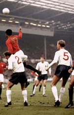
Tournaments: World Cup 1966 (England), World Cup 1970 (Mexico)
Manufacturer: Umbro

The good: Surely the most iconic – specific – football kit of all-time (while the yellow shirts, blue shorts and white socks of Brazil are recognised by, well, everyone, how many peeps can identify a specific Brazil kit from another?), this is of course the one in which England won the World Cup on that glorious day in late July 1966. Away from being rightly and forever associated with such an outstanding and (in terms of what happened in the match itself) dramatic occasion, its greatness lies in two unarguable facts – its combination of bold scarlet (the shirts and socks) and snow white (the shorts and numbers on the back of the shirt) is simply gorgeous and the sheer simplicity and beauty of its design (no pretensions whatsoever; merely a hooped collar, an England badge over the left breast and a classic, perfectly clear font for the shirt numbers) is impossible to ignore, dismiss and, frankly, dislike. For many, this is the England kit – and it’s very hard to argue with that.
The bad: While England won the World Cup in this kit, they also rather memorably and not a little ignominiously went out of the next one in 1970 (against the Germans) wearing it. A tad careless you might say, given it was these awesome togs there were sporting.
The ugly: Find something and tell me, I dare you.
That was when: Er, like, when we won the World Cup.
.
.
Tournaments: World Cup 1966 (England), Euro ’68 (Italy), World Cup 1970 (Mexico)
Manufacturer: Umbro


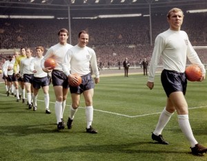
The good: Like I said above, for many the red-and-white ’66 World Cup final outfit is the England kit and it’s very hard to argue with that – well, suck it up, folks, I’m going to. For, in spite of posterity taking it upon itself to intervene and convince millions it’s otherwise, this effort (the home version of the aforementioned classic) is actually the England kit. The evidence? It’s exactly the same design as the away version (hooped collar, England badge over the left breast and the same perfectly rendered shirt numbers), but in the bona fide England home colours – pristine white shirt and socks, stark navy blue shorts and unarguably brilliant bright red numbers on the back of the shirt. As I’ve mentioned already in this post, I’m something of a purist when it comes to England kits and it’s simply impossible to point to a purer England kit than this one; the colours are absolutely perfect, the hooped collar design (adopted for the ’66 World Cup by Umbro after a v-neck affectation following their winning back the manufacturing rights in the early ’60s from Bukta) is indefatigably elegant and the Three Lions walked out in these togs for a full nine years straight for the vast majority of their matches until unwisely the FA decided to go with Admiral’s replica-kit-promising deal in the mid-’70s. Any surprise this change coincided with England’s inability to get anywhere near qualifying for a tournament until the ’80s? What do you think?
The bad: I can’t think of anything ‘bad’ you can associate with this kit – watch the corresponding clip (by clicking on the ‘Home kit (1965-74)’ title above and tell me wrong.
The unlikely: As there’s absolutely nothing ugly about it, here’s an unlikely fact about the kit: as the 1970 World Cup was held at the sweltering height of summer in the high-altitude Mexico, manager Alf Ramsey ordered a ‘light-weight’ version of the kit for his players. The one-off result was a kit produced from the cellular, hot-climate-appropriate material Aertex (see ‘Click for World Cups’ image of Bobby Moore in the page’s right-hand side-panel).
That was when: England won the World Cup, finished third in the first ever European Championships, faced Pelé in the next World Cup and then cocked up a qualifying campaign (unforgettably against Poland) for the very first time – in short, the most iconic era of the England football team.
.
.
And, yes, the five worst…
CLICK on the titles for images
.
5. Home kit (1993-95)
Looks like it was designed by a 12-year-old with an oddly enormous England badge and a repeated, why-bother miniature badge in the collar
.
4. Home kit (1999-2001)
An ill-conceived effort presumably designed to appeal to retro enthusiasts that fails miserably thanks to its poor double-hooped collar and ugly horizontal-line-imprints across the shirt front
.
3. Away kit (1995-97)
The legendary one that those Euro ’96 heroes wore against the Germans in that tournament’s semi-final, its makers claimed it was ‘indigo blue’, but everyone immediately saw through the transparent marketing b*llocks – never again have England got close to wearing grey (and hopefully they never will)
.
2. Home kit (2007-09)
A horrid concoction this, to my mind. Returning to an ‘8os-esque over-preponderance of their diamond logo, Umbro featured the damn thing on the shirt’s right shoulder and then scrawled a horrible non-symmetrical red line across the shirt front’s shoulders. There’s also that ‘partial reveal’ of the England badge under the arms, which makes it look like the shirt’s split at the sides and there’s another one underneath. Or something.
.
1. Alternative away kit (1976)
So bad it’s laughably bad (and thus rather gloriously so), this effort is bizarrely not the only instance that saw England dressed in yellow – our fellers actually inexplicably played in a Sweden-style yellow-shirts-and-blue-shorts outfit for three matches in 1973. But even that kit was better than this God-awful pale yellow thing. I mean, it’s truly terrible; it’s in the hooped collar style of the classic Umbro kit, which given it was produced by Admiral after the era of those kits is just odd, and even the England badge looks tatty. Even better/ worse (delete as appropriate), our boys wore it in a non-FIFA-recognised match against an ‘all-star’ USA team featuring Pelé and skippered by, yes, Bobby Moore. Oh, and who was our captain? Gerry Francis. Yup, you couldn’t make it up (here’s the filmed evidence). A true kit-astrophe.
.
.
Further reading:
historicalkits.co.uk/international/england/england-1960-1984
historicalkits.co.uk/international/england/england-1984-1997
historicalkits.co.uk/international/england/england-1997-2010
.