Still looking good: another roster of rare movie posters
Not to big up this blog of yours truly too much, but one of its most popular posts has been an effort I put together last September featuring 20 of my favourite rare film posters. Well, in that great (and, admittedly, sometimes not so great) Hollywood tradition of the sequel, I’ve decided with this very post to repeat the trick.
So, here follows, mes amis, a score more of – to my mind – terrific but too little talked about, pored over and purchased movie posters of lore. Unlike last time out, most of the examples of this collection are grouped together by genre, theme or poster artist – not because I’m trying to go too arty on you all, you understand, but merely to try and better highlight why methinks they’re such damn good posters. Anyhoo, enough with the waffle; on with the perusal…
.
CLICK on the images for full size and on the film titles for more information
~~~
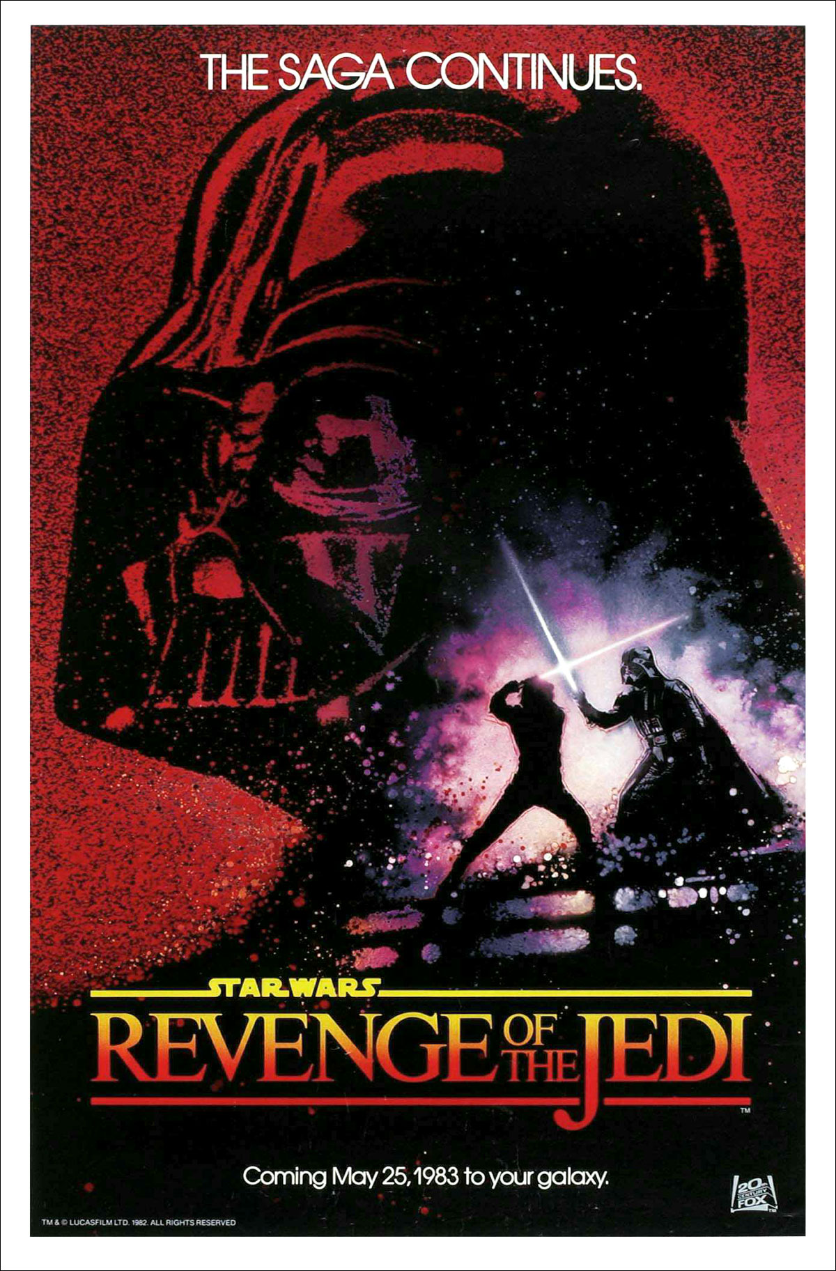
Return Of The Jedi (1983) ~ for USA market (unused artwork)
(Above)
Wait a tick, there wasn’t ever a Star Wars movie called Revenge Of The Jedi, was there? Yes, peeps, our opener this time is a real teaser of a would-be teaser poster. You see, Revenge Of The Jedi was the ‘working title’ for (as the poster suggests, if you look at the line of type at its bottom) 1983’s Return Of The Jedi. Quite the rare piece of film publicity this then – but a real goodie too. This ‘un, methinks, is a great exponent of the use of watercolour on a movie poster (when do you ever see that nowadays?). Only a watercolour could produce that wonderful splash, or even explosion, of light in the bottom right-hand corner – ostensibly created by the duelling lightsabers – suggesting the epic, nay operatic, clash between good and evil (or, to be specific, Luke Skywalker and Darth Vader) that would await us in this final instalment of Star Wars‘ original trilogy. Classic stuff, indeed.
~~~
Judgment At Nuremberg (1961) ~ for USA market/
A Bridge Too Far (1977) ~ for UK market
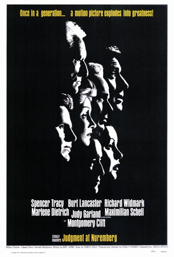

Often there’s no better way to sell a product than by using a famous face – and these two posters do that with bells on. Frankly, given the fact their respective flicks feature casts absolutely bulging with Hollywood heavyweights, why the hell not? The better of the two surely must be Judgment At Nuremberg‘s; the starkly white but very familiar faces in profile on a simple black background not just creating a striking image, but also nicely reflecting the dark sombre subject matter of the movie (the post-WWII Nazi war crime trials). A Bridge Too Far‘s poster then isn’t a classic and is pretty blatant in selling its film on the strength of its stars by featuring mugshots of them in character (indeed, its alternative parachutes-landing-on-a-pink-backgound version is probably more satisfying), but for me there truly is something charming about its shameless selling – I mean, back in ’77, how could you have not wanted to see an epic war film with all the guys this image purports are in it?
~~~
Dr. Who And The Daleks (1966) ~ for UK market/
Thunderbird 6 (1968) ~ for UK market


Two hugely popular ’60s British kids’ telly shows transferred to the big screen here and done so with the aid of a pair of stonking posters. The first is simple as you like, but effective as hell. What I love about it is that it leaves you in little doubt as to who the main draw is – and it’s not Who (as he was here, not ‘The Doctor’ as in the Beeb’s classic still-running series); yup, it’s unquestionably those pesky tin-pot scallywags from Skaro, the Daleks. If you were at all unsure from the main image – how could you be, they’re enormous compared to the human characters on the extreme left? – then the size of the font that the word ‘Daleks’ in the title is given absolutely rams home the message. The Thunderbird 6 poster is (perhaps sad to report) air-miles and air-miles better than the actual film it promotes. Honestly, the flick itself possesses none of the style, dynamism and downright cool of this image. Mind you, like its poster, it does have both Lady Penelope and Parker in it, which is something at least, I guess.
~~~
Thunderball (1965) ~ unused artwork/
The Great Escape (1963) ~ detail from artwork/
Danger Diabolik (1968) ~ detail from artwork
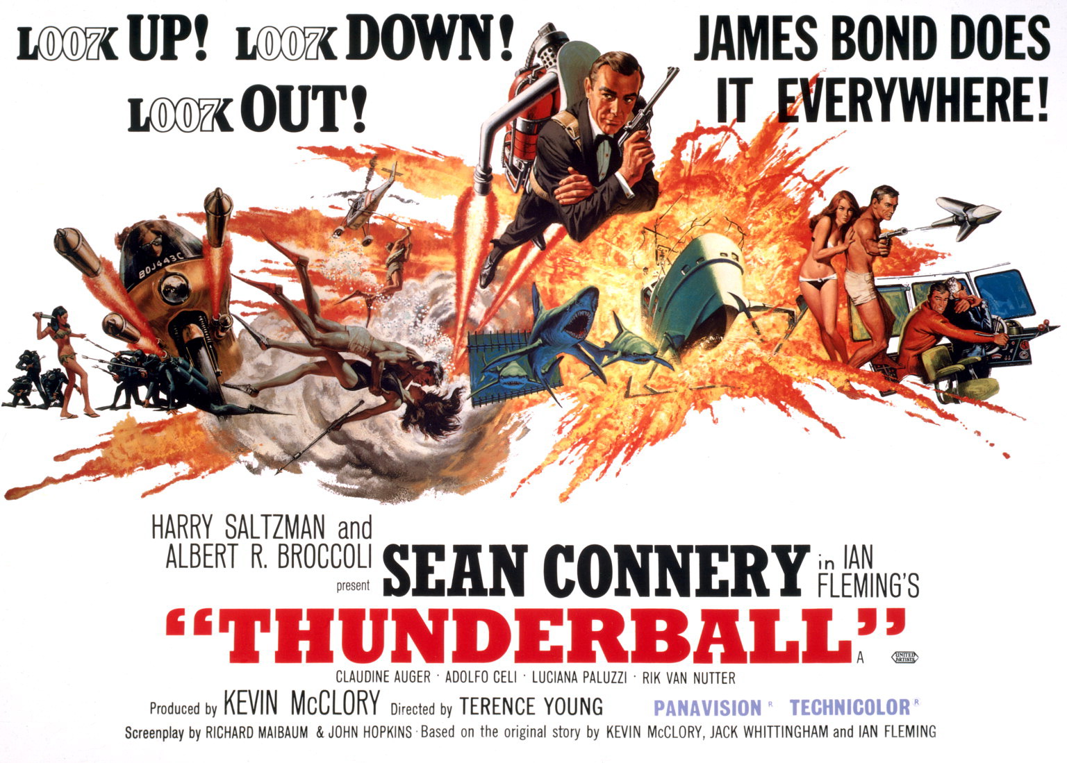
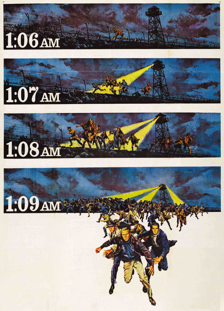
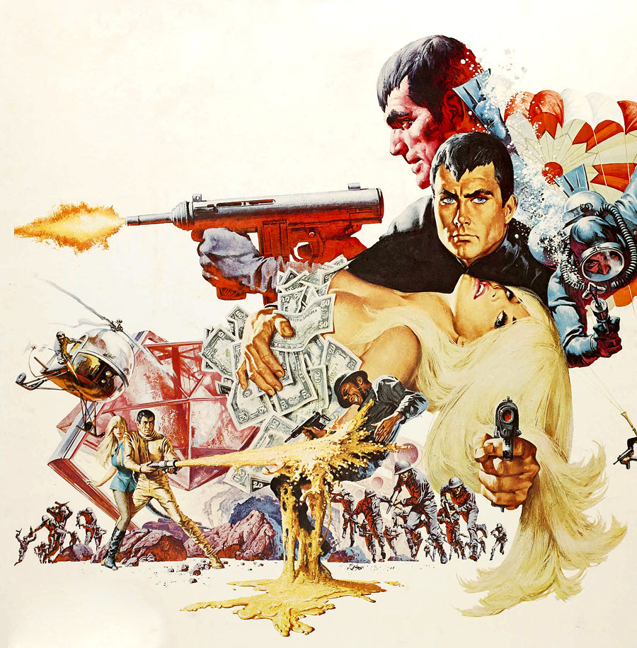
Three posters here (I spoil you, I know, I really do) and all by the same artist, Frank McCarthy. In addition to being a producer of fantastic film posters, the late, great McCarthy also expertly doodled paperback covers, advertisements and magazine artwork, until in 1968 he gave up all that commercial stuff to focus on what he’d always held most dear, paintings of the American West. His cinema work, though, included posters for The Ten Commandments (1956), The Dirty Dozen (1967) and Once Upon A Time In The West (1968), but here are – to my mind, at least – perhaps his three best efforts in the name of film advertising. Macho, exciting and naturalistic but with a flair for the fantastic (like much of his poster art), all three display McCarthy at the peak of his movie publicity powers. The first is an unused artwork for the Bond film that came at the height of ’60s ‘Bondmania’ Thunderball, which for me is better than the actual posters used for the film – McCarthy created it in conjunction with felllow artist Robert McGinnis, with whom he also produced posters for the 007 epics You Only Live Twice (1967) and On Her Majesty’s Secret Service (1969). The second effort is for The Great Escape and is a genius example of using time-lapse to build anticipation from the top to the bottom of the artwork (why the technique wasn’t used in the movie’s main poster, I’ll never know). The final effort comes from the little-seen spy hokum Danger Diabolik and simply demonstrates an awesome composition – no doubt far better than that of the flick itself.
~~~
Modesty Blaise (1966) ~ for USA market/
Billion Dollar Brain (1967) ~ for USA market
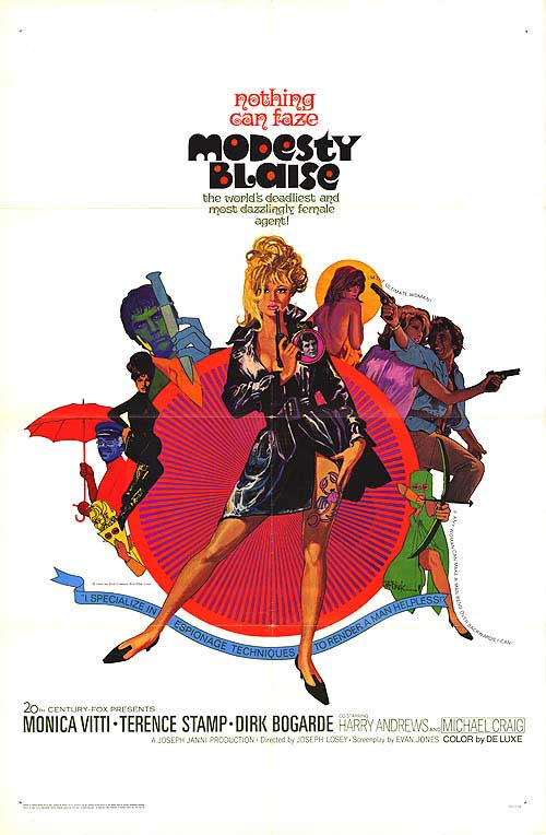
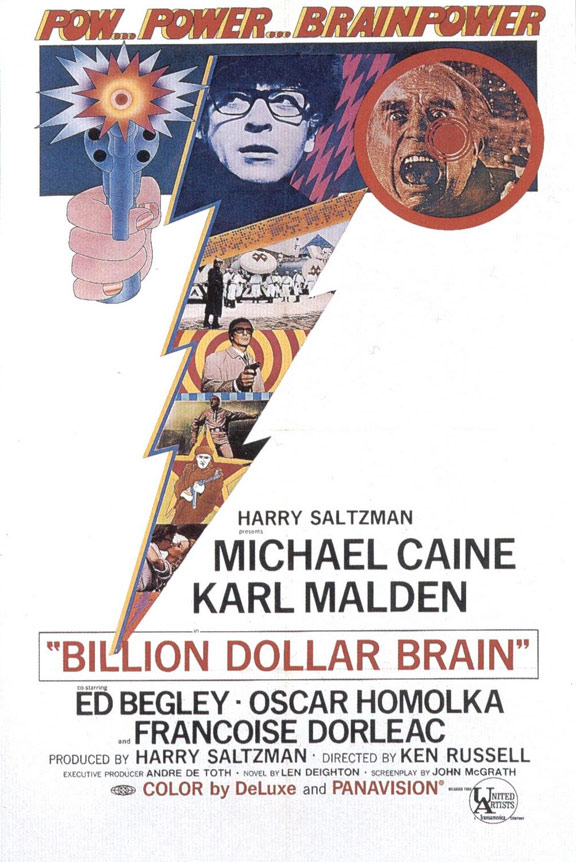
Continuing the theme of ’60s spy cinema started with the immediately preceding images, here’s artwork for two unquestionably cult espionage flicks from the decade of ‘spy mania’. Modesty Blaise is an adaptation of the classic Peter O’Donnell comic strip featuring his sexy, feline anti-hero and, tipping its hat to – by that time – ’60s design’s growing predilection for psychedelia, its poster is a florid combination of McCarthy-like action-oriented characters and bright and bold colour (all pinks, reds, yellows and greens) smoothly circling about a becoming Monica Vitti blowing on the end of her phallic pistol. Nice. By contrast, the poster for Billion Dollar Brain (the second sequel to 1965’s utterly iconic The Ipcress File) is a lightning bolt of psychedelia – quite literally. Along the top it boasts Michael Caine in those oh-so cool specs, a pop-art firing pistol and Ed Begley’s face in the middle of a scream, then one’s eyes are inevitably drawn down that image-packed jagged slash to the credits at the poster’s bottom. And just check out that tagline; cool, rather clever and definitely crazy – very much like the movie it promotes.
~~~
Bob & Carol & Ted & Alice (1969) ~ for USA market/
About Last Night (1986) ~ for USA market

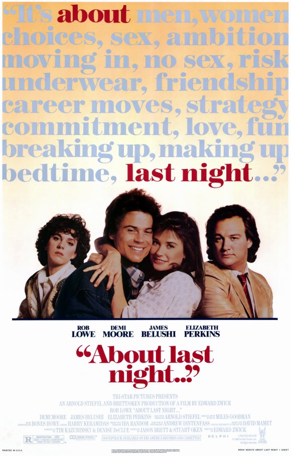
Of all the players in poster design’s clever production company, not often does type – or, if you prefer, simple writing – take centre-stage. After all, posters are usually, understandably all about the image, right? Here, though, are two fine examples to the contrary, which let the writing, er, do the talking. Coincidentally too, both the movies to which they belong concern themselves with sexual relationships. The first is the landmark Bob & Carol & Ted & Alice, if not Hollywood’s first frank foray into the exploration of sexual mores in a – by the late ’60s – increasingly liberated and experimental society, then surely its first flick to focus on swinging. Its poster is a classic. By repeating the film title over and again and cramming together the words – and thus the protagonists’ names – and following that up with the wonderful tagline below (‘Consider the possibilities’), the viewer is inevitably left to conjure up all the pairings, threesomes and foursomes as they might involving that quartet in question. Putting the words on a horizontal slant too and in varied bright colours adds a fitting hint of pop art-iness and psychedelia. About Last Night’s poster is less bold and therefore arguably less impressive than its predecessor’s (especially given the presence of the mugs of the movie’s stars at the bottom), but in making typography the major thing – and nattily highlighting the words of the title in a long, descriptive sentence – it’s a similar and very effective effort.
~~~
Woodstock (1970) ~ for USA market/ M*A*S*H (1970) ~ for USA market

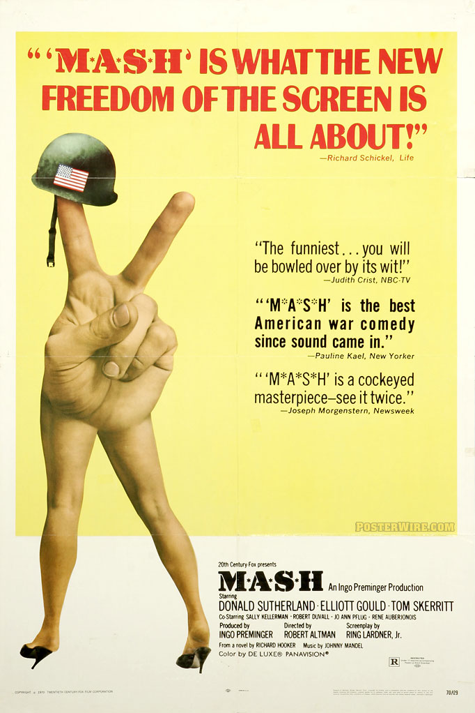
The ‘V-‘ or ‘peace sign’. First popularised by Winston Churchill upon the Allied victory at the end of World War Two and then adopted 20 years later by idealists of a much younger generation in defiance of the Vietnam War and other conflicts. It will, rightly then, always be associated with hippies and, while captured in thousands of photographs of the time, it was also captured on the posters of two prominent movie of the period – and here they are. The more famous of the two artworks (although you may not be familiar with it) was created for Robert Altman’s breakthrough film, the superb anti-war satire M*A*S*H. Once seen, this poster really is never forgotten. The use of the ‘V-sign’, with a soldier’s helmet (which sports a Stars And Stripes flag) resting on the index finger and the bottom of the hand transforming into a pair of comely, slender woman’s legs is genius, indeed. The image perfectly reflects the film’s themes and unquestionably hints at its gauche, knowing and anarchic tone. By contrast, the poster for the Woodstock documentary is a very rare one. Its better known relations are those that include photos from the legendary 1969 concert, but this one’s different – its image is painted and is properly provocative. Like on M*A*S*H‘s poster, the ‘V-sign’ is prominent, but being delivered by a young woman seemingly bewitched (by the music at Woodstock or substances sampled there, or perhaps both?), whose body is artily ‘painted’ in the blue, red stripes and white stars of America’s flag, the fusion – and therefore juxtaposition – of anti-war sentiment and (anti-?) US patriotism is arguably even more obvious than on the other poster. Less brash then, but just as pointed.
~~~
Gold (1974) ~ for UK market/ InnerSpace (1987) ~ for USA market
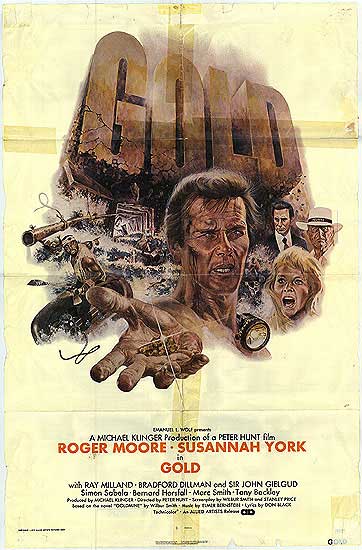
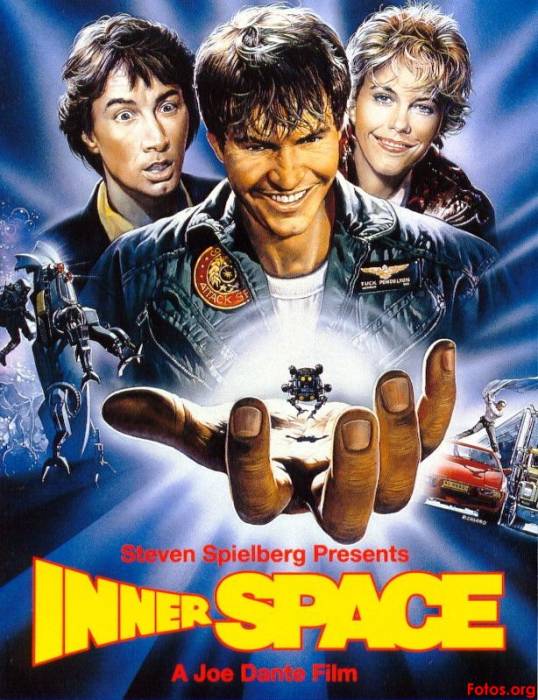
A hand gesture is what ties these two posters together too, but this time the gesture is an opened hand in the extreme foreground. The first is offering us something – gold, no less. Yes, the 1974 Roger Moore and Susannah York-starring Gold may not be the best adventure drama about South African precious-metal mining you’ll ever come across (mind, no others actually spring to mind right now), but its poster is a doozie. Not only do we have the lovely Susannah pictured mid-shout/ scream, Moore looking macho with his cheek bleeding and frantic images of drilling-gone-wrong all over the shop, we also have the film’s title rising in the background in a huge, daft Ben Hur-like stone font and, of course, Sir Rog over dramatically offering us a handful of glinting gold. Barmy but brilliant. InnerSpace‘s poster is, admittedly, less ridiculous, but no less impressive. In fact, it’s arguably more so. Unlike with Gold‘s artwork, our eyes are immediately drawn to the protagonist’s (hero Dennis Quaid) outstretched hand, which isn’t offering us anything but holding the macguffin of the film – the ‘innerspace’ capsule in which he ‘miniaturises’ and enters another character’s body. There are images of action dotted on either side of the poster too, but we’re reassured this movie is definitely a comedy (if very much a sci-fi comedy) by the shocked-silly look on Martin Short’s face, the smiling directly at us by Meg Ryan and that sly, slick grin of Quaid’s. It’s a great poster, indeed, and although a remake (of 1966’s Fantastic Voyage), the flick’s an , ahem, little gem too.
~~~
The Spy Who Loved Me (1977) ~ for Hungarian market/
Tootsie (1982) ~ for Polish market

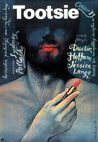
If film posters straight out of left-field are your bag, then these two have got to be for you. They’re European, for sure, but not produced for European flicks – one for a very Hollywood movie, the other for a Bond flick (which is probably best described as Anglo-American, or, er, Anglo-Hollywood). The latter is a Hungarian effort for that ultimate ’70s 007 blockbuster The Spy Who Loved Me – not that you’d guess that unless you spoke Hungarian. However, aside from all its adventure, explosions, comedy, comic-book violence and mild sex, you perhaps could describe Spy as a tale of two espionage agents from either side of the Cold War having to come together for the world’s greater good, despite the ideological, sexual and emotional tensions between them. And, you know, I’d argue all that’s rather well referenced in this poster. In a wack-job of a way, of course. The stamping of the male foot (Britain’s James Bond) and the female foot (Soviet Russia’s, ahem, Agent XXX) on that shotgun sort of suggests all that. Sort of. In any case, there’s surely no question that it’s a striking, unforgettable image – and that has to be the priority for a good movie poster. Mind you, if Spy‘s Hungarian offering is rather odd, then Tootsie‘s Polish effort at publicity is downright bizarre. Yes, it gets across the the film’s cross-dressing theme what with a bearded figure applying lipstick to his rather feminine-looking mouth, but why on earth is the whole thing such a dark image? It almost seems to suggest the film’s a violent slasher featuring the exploits of a transvestite killer rather than a finely executed comedy-drama about a desperate thespian who pretends to be a woman in order to land an acting gig. Moreover, the grafitti-like freehand type (included vertically, no less) also suggests the movie’s far artier than it really is. Still, despite all that (in fact, exactly because of it), I think it’s a work of art-oddity magnificence. Er, probably.
~~~
The Great Muppet Caper (1981) ~ for USA market/
Back To The Future (1985) ~ unused artwork
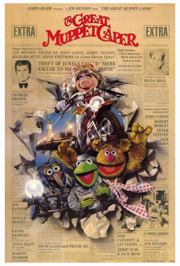

And, finally, peeps, two (or more) posters that could only be from the ’80s. Why? Because they were all created by the king of Hollywood poster art in the ’80s, the one, the only Drew Struzan. The artist made his name thanks – as, seemingly, for so many involved in ’80s Hollywood – to his connections with George Lucas and Steven Spielberg, having created posters for every one of the Star Wars, Indiana Jones and Back To The Future films. In recent years too, you’ll recognise his work on the poster for Harry Potter And The Philosopher’s Stone. It’s for the classic, original Back To The Future adventure, however, that the four artworks on the right were produced. What I find particularly interesting about them, must say, is that none of them were ultimately used (the Struzan image that made the grade in the end, of course, was the one that featured Michael J Fox emerging from the DeLorean time-machine car). None of the quartet above are as impressive and, thus, as potentially iconic as that one perhaps, but then none of them are bad either – at least three of them ably give the viewer a good impression of the movie they would have been selling (the one with the hand and watch is a little weird, mind). And, to my mind, had Struzan’s other, rightly chosen image not been selected, the one with Fox’s character pulling the minute hand of the clock-face (bottom right) could certainly have been used as the film’s main poster. Our final artwork is a true Struzan classic and, oddly, is little seen. It’s for a Muppet movie, oh, yes; indeed, the one that features Kermit & co. working as newspaper hacks (not for The News Of The World, though, don’t worry). Thus, quite brilliantly, not only are our furry friends excitedly breaking through newspaper, but the ‘paper itself features the film’s credits as if they’re news stories. No, really – take a closer look. It is, unquestionably, a work of poster art genius. Indeed, best to agree with me on that or you may have to face a Miss Piggy judo chop… 


Trackbacks