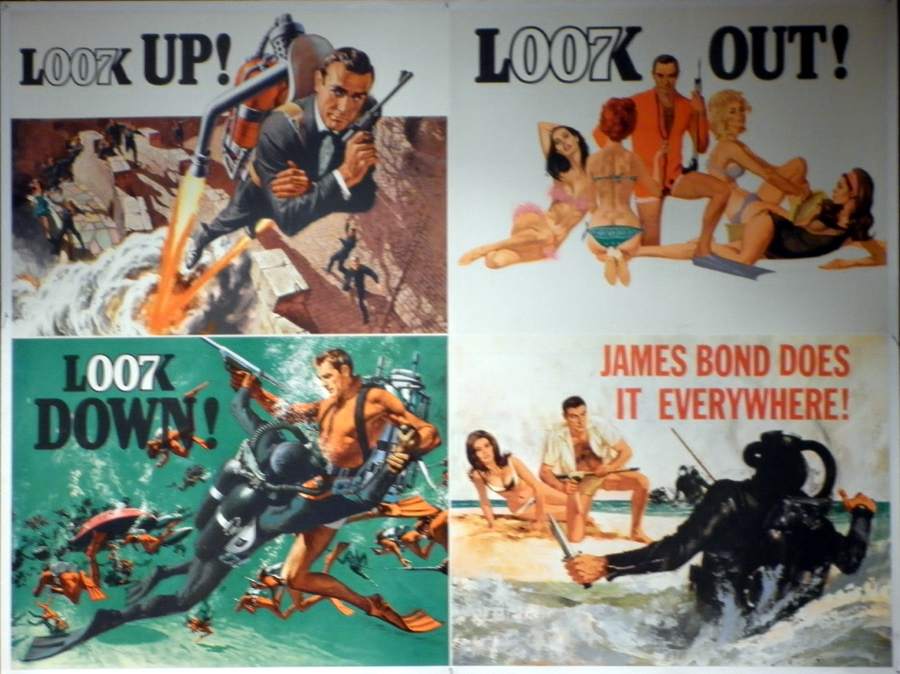
A little tease: detail from teaser posters promoting Bond movies from each of the six different 007 eras
So have you caught it yet? Are you trying to figure out what Blighty’s finest’ll be off doing this time? Theorising just how the mystery behind the new criminal organisation’ll pan out? And wondering just how much of Hans Landa Christoph Waltz’ll channel as Franz Oberhauser? Yes, I am, of course, asking whether you’ve checked out the brand-spanking new teaser trailer for James Bond’s official 24th adventure SPECTRE, which went online just over 24 hours ago (watch it at the bottom of this blog post if you haven’t). Teaser trailers are exciting things, for sure – and none more so than for Bond movies. However, there is an important part of the pre-release marketing mix for practically every 007 flick that usually surfaces before any trailer: the teaser poster.
Yes, this type of poster (the very first poster for a Bond movie, which often features little visual clue of what’ll come in the film proper – because, yes, it’s a tease) often summons up as much excitement in Bond fandom – and, its only fair to say among media bods and sometimes the mass public – as its equivalent trailer. And Eon Productions, the company that owns the Bond brand and makes the movies, have always been very keen to enlist its use. Indeed, the history of the Bond teaser poster goes as far back as the mid-’60s (yes, really) and, so far, only four of the series’ flicks haven’t been preceded by one.
In which case then, peeps (if you’ll indulge me), here follows a pictorial post celebrating and dissecting the different – often very different – teaser posters we’ve been gifted and enjoyed from Bondom down through the years. You may not agree with my judgments on all of them, of course, and naturally I don’t expect you to read my thoughts on every single one of them. My suggestion is to dip in and out of them as you see fit; in fact, rather like you might with your Bond DVD collection…
.
.
. 1965 ~ Thunderball .
Appropriately enough, the very first teaser poster – or advance poster, as they were referred to back then – was an effort for the movie that opened during and sustained the mid-’60s ‘Bondmania’ era, the Caribbean cruise-athon that’s Thunderball. Offering something of a rearrangement of the separate images that would make up the flick’s main poster (albeit with a different final image – here in the bottom left corner), its detail-heavy and visually rich, while the triple repetition in the four-part tagline (nattily incorporating the 007 logo) hits the spot like a bolt from Connery’s harpoon gun.
.
.
.
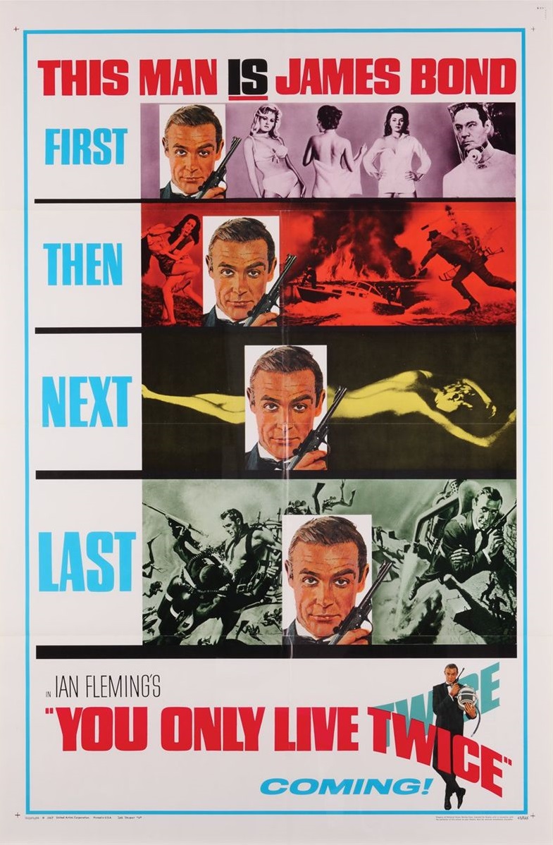
1967 ~ You Only Live Twice
.
Sleek, smart and oh-so efficient, You Only Live Twice’s advance effort perfectly reminds cinemagoers of what they’ve already enjoyed from Bond (specifically, detail from posters of his previous four adventures – cleverly tying them in with that ever increasing-in-size marketers’ dream that’s Connery’s mug), until at the bottom delivering the next film’s title in the terrific typeface-image-combo that’ll adorn the main posters to come. If this didn’t bait your breath for Bond in ’67, nothing would have – ‘Coming!’, indeed!
.
.
.
1969 ~ On Her Majesty’s Secret Service
.
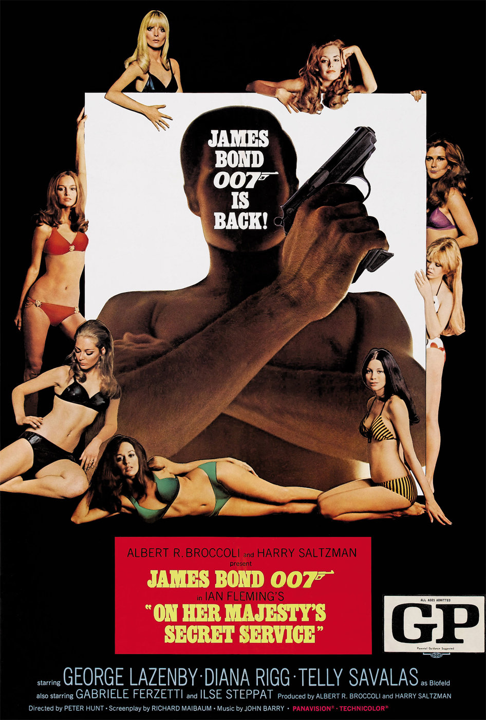
Faced with the quandary of, for the first time, having to sell a Bond film without Sean Connery, the Eon marketing machine took the interesting decision with the advance poster (left) for On Her Majesty’s Secret Service to, er, ignore altogether the fact there was a new actor. Not only does new boy George Lazenby not even get a mention before the bottom of the poster (his name can be found down there among the detritus of the flick’s principal credits), but also his face at the centre of the poster is entirely obscured by the legend ‘James Bond 007 is back!’. Perversely, this merely exaggerates the fact Connery’s absent and a new no-name’s filled his Saville Row duds. Matters too aren’t helped by the image giving the impression the new Bond’s some sort of muscle-man-giant with an eerily enormous right hand. Even more interesting is the concept art on the right, which was created but ultimately not used for the teaser poster campaign. Again, it’s focused not on selling the new star-in-waiting but the unique content of this 007 film – Bond and his bride-to-be. It’s also fantastic, pop art-like monochrome photography work.
.
.
.
1971 ~ Diamonds Are Forever
.
A bit of a letdown, this one. With Connery back as Bond, you’d assume the teaser poster for Diamonds Are Forever (left) would absolutely go out of its way to stress the fact, but it doesn’t. Clearly this UK advance was an afterthought – its image is cobbled together from the artwork of the main poster to come and, yes, while it definitely features the big draw that was The Big Tam, it doesn’t even bother to spell out the fact he’s back in the role in its wording. Let’s face it, it’s just pants. Conversely, to the right is a fascinating insight into what Diamonds’ teaser poster could have been. It’s concept art again (carrying the wording and typeface that would be used for the main poster campaign), but just how cool is that loose, languidly rendered image of Connery’s Bond? Where’s he off to? Why’s he got half a smirk on his face? What’s in his briefcase? So many questions – what a great tease that would have been…
.
.
.
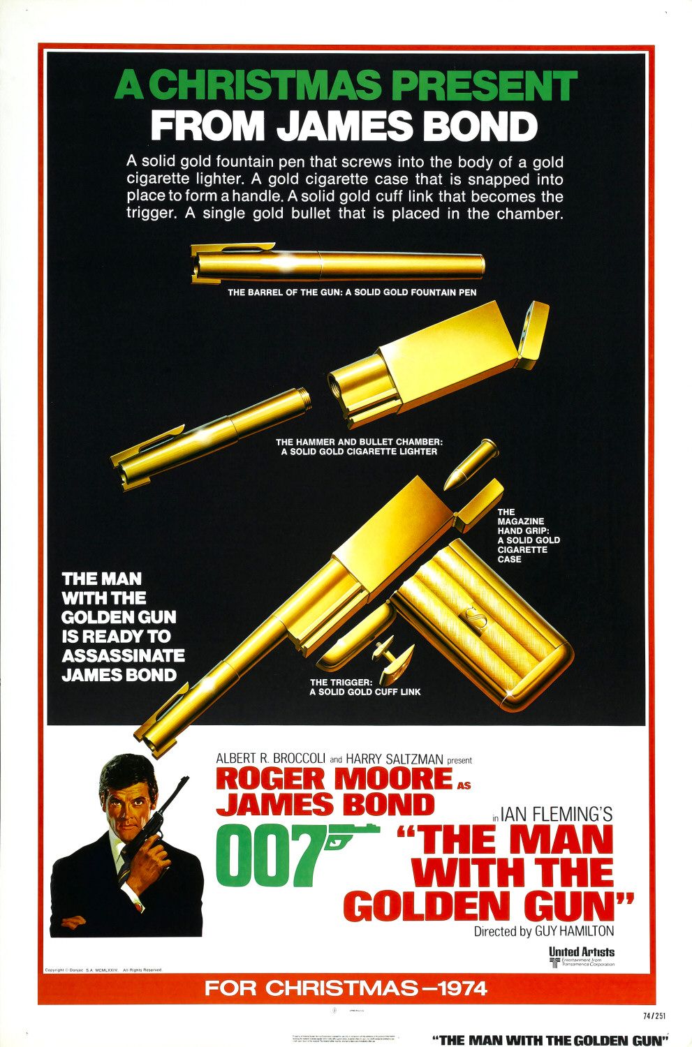
1974 ~ The Man With The Golden Gun
.
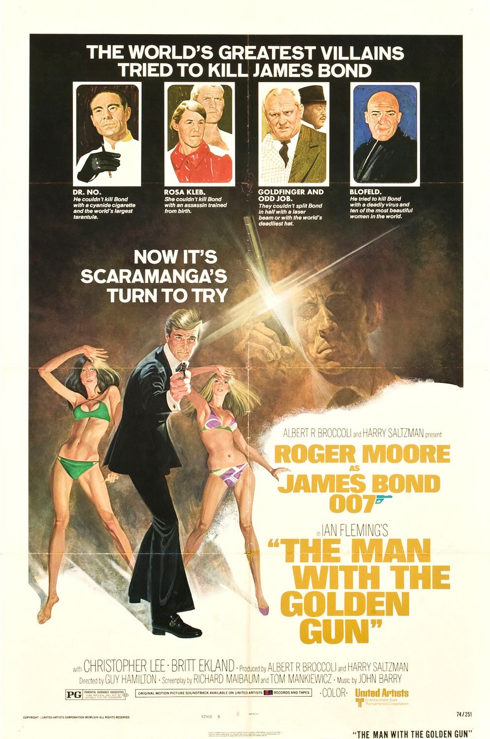
A curate’s egg of a teaser within Bondom ’tis the one on the left. It’s very good (easily better than the film it promotes), but as an advertising wheeze a wee bit wordy – it looks more like a full-page magazine ad, but apparently it was a proper advance poster for The Man With The Golden Gun; albeit released in December ’74, the month at the end of which the movie itself came out. Still, like I said, the poster’s a good ’un, explaining and displaying the ingredients that make up the ingenious golden gun wielded by the titular character, which when assembled means he’s ‘ready to assassinate James Bond’. Again, the flick’s second advance effort (right) is better than the flick. Also released in December ’74, it sets up baddie Francisco Scaramanga as a match worthy of 007 by associating him with the greatest villains our hero’s previously faced. A top idea finely executed – mind you, the way in which it references Oddjob’s murderous techniques does make one wonder just how many other deadly hats the world has seen…
.
.
.
1977 ~ The Spy Who Loved Me
.
Come 1977, Bond had been away from the big screen for three years (at that point in the series an unnervingly long time) and, in order to reassure fans he’d lost none of his chutzpah, his return in The Spy Who Loved Me was big, brash entertainment. Also come 1977, it was, of course, the age of John Travolta and The Bee Gees. Both of these things can be seen in the advance poster for Spy. Don’t be deceived by that grey background (greys, browns and beiges were strangely popular and effective in ’70s design) because this is bold, starkly simple marketing – Roger Moore’s Bond looking at his most dapper and confident, flanked by Barbara Bach’s equally self-assured drop-dead beauty (now, she looks like a Bond Girl, all right!); both of them derived from the artwork of the main poster. And then there’s that tagline, which would also bless the main posters – raffishly cocked at an angle and sounding vaguely disco-naff, it pronounces this is Bond in the ’70s, very much loving it and inviting you to do so too.
.
.
.
1979 ~ Moonraker
.
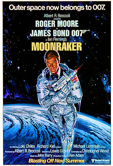
In 1975, so the legend goes, the phenomenon of the summer blockbuster was born with the release of Jaws – and was only consolidated by the even bigger release of Star Wars two years later. From then on Hollywood studios fell over themselves to outdo each other with bigger and more bankable adventure blockbusters-to-be each summer – and naturally Bond slipped as comfortably into this bracket as does his Walther in its shoulder holster. Eon and Bond studio United Artists were obliged to follow the new summer blockbuster marketing trend and unleash advance posters earlier than ever before for their latest 007 epics and Moonraker’s teasers (and the movie itself) is a prime example of this. Released in early ’79, the main advance poster (left) for the unashamedly Star Wars-influenced sci-fi fantasy not only leaves the viewer in absolutely no doubt Bond will, yes, enter space, but also informs them he’ll be ‘blasting off next summer!’. Talk about whetting the appetite months and months in advance. Which is a moot point because the alternative teaser for the US market (right) totally fails to do that; frankly, it’s dull as dishwater – even the Moore imagery’s borrowed from the Golden Gun campaign of five years before.
.
.
.
1981 ~ For Your Eyes Only
.
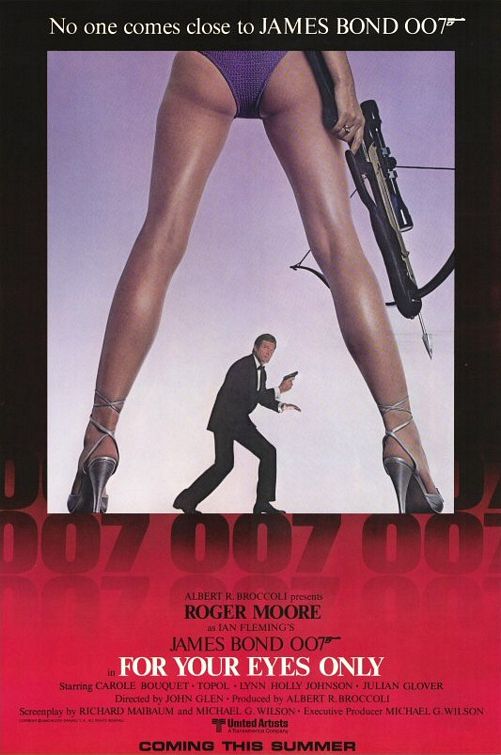
Despite appearing to be a mere forerunner to its main poster, For Your Eyes Only’s advance US effort in fact turned out to be arguably the most infamous of them all among Bond fans. Why? It’s all about that girl with the crossbow (whom, of course, suggests the movie’s leading female character, the vengeful Melina Havelock). Yes, like the poster’s general composition, its fonts and its tagline (if not the figure of Bond’s Moore in the centre and the neutral grey background), the girl’s legs, shoes and backside would all be repeated again on the flick’s main poster that came out just a month or two after this one. But, for some reason and not a little peculiarly unlike for the main poster, that panties-clad posterior caused a real, er, rumpus in America’s more conservative states, which decreed the revealing intimates be replaced by something more substantial. Thus, denim-like shorts were superimposed over them. Yes, really. By today’s standards it all sounds like a storm in a teacup – not even over a g-string, you might say.
.
.
.
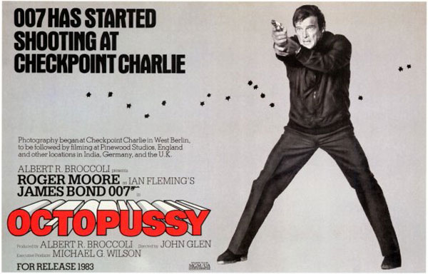
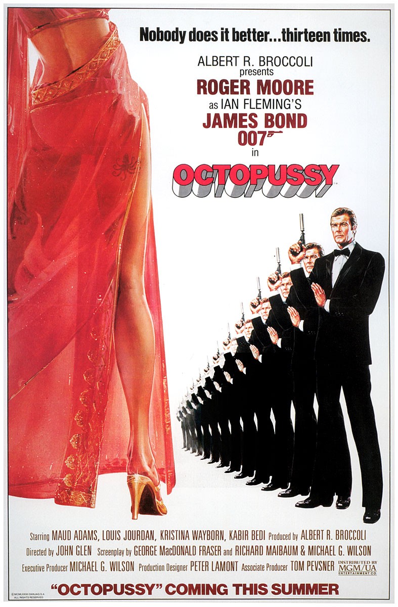
1982-83 ~ Octopussy
.
Octopussy, the Bond flick that, more than any other, harbored hard-nosed Cold-War aspirations, was the series’ first to offer up a truly ‘super advance’ teaser poster a whole year before it opened, in the shape of the effort on the left. With a background daubed in almost Berlin Wall-like bland grey and featuring a practically outfitted and troubled, nay anxious-looking 007 (rare in the Moore era – not least on his posters), it’s nonetheless dynamic stuff, informing audiences the movie’s excitedly just started filming at Berlin’s notorious Checkpoint Charlie, with Bond shooting at an unseen opponent whom appears to have let off several shots at our man – and nearly hit him. The message is clear: this Bond movie means business. Meanwhile, a later teaser poster (right) for some inexplicable reason plays up the fact Octopussy will be the series’ 13th by showing a full 13 Rog’s up against the titular Bond Girl. Is it effective or just a bit odd? Good question (which could be asked of the movie itself), but it’s certainly memorable.
.
.
.
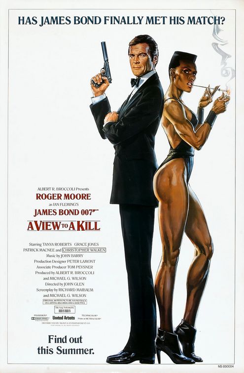
1985 ~ A View To A Kill
.
For many, A View To A Kill is the nadir of the ’80s Bond (gotta admit, for me it’s anything but), yet surely all must agree its first teaser poster (left) is a doozie. Stark and simple but unquestionably elegant, the black tuxedo-clad, mature Sir Rog back-to-back with the near opposite that’s the equally stylish but hot-to-trot-modern Grace Jones, both set against a white background, makes for a hell of an image. And per the tagline, it really does make us wonder if Bond may actually have ‘met his match’ – boy, do we want to ‘find out this summer’. By contrast, the poster that came out in early summer ’85 for the US market (right) is, well, a bit weird. Sure, again it gives us the dynamic Jones – rightly one of Kill’s biggest selling points – and sets her and Moore against an Eiffel Tower-featuring Paris backdrop, but Jones’ villainous May Day skydiving towards Rog, while the tower (after it’s correctly narrowed from the bottom) widening towards its top leaves the perspective distractedly askew. Plus, what’s up with Moore’s hair? Why’s it so wide? And, let’s be honest, the tagline at the top’s pretty crappy. All in all, not much of a French fancy.
.
.
.
1986-87 ~ The Living Daylights
.
The late ’80s brought a new Bond, Welsh Shakespearean heavyweight Timothy Dalton – and a (supposed) re-commitment to the series’ origins, Fleming’s hero of the books. In promoting this new direction, the marketing bods seemed to want to tap back into the simple, sharp but elegant sophistication associated with Fleming’s 007, to be seen in the posters for Timbo’s debut The Living Daylights. The first advance effort coincided with the start of filming in ’86, its strategy presumably to prepare audiences for the directional shift and to highlight the fact Eon’s Bond was about to celebrate his silver anniversary. Fittingly then, this poster (top) is an elegant tease in silver and dark hues featuring one of the movie Bond’s most elegant icons, the Aston Martin DB5. The later teasers for the US (bottom left) and UK (bottom right) would take this theme and run with it, utilising perhaps the greatest – certainly the coolest – publicity shot ever captured of Dalton as 007 and stamping on them taglines emphasising his ‘dangerous’ credentials. Of the two, the US version’s better, in fact for me it’s a classic.
.
.
.
1989 ~ Licence To Kill
.
Although moderately successful with the previous film, the ‘darker’ Dalton gamble hit the skids with Licence To Kill. Those fond of it blame its weak marketing campaign, but the flick’s crapness is most culpable. Still, there’s no doubt the publicity was pants too, not least its posters. The image that blesses the US teaser poster (left) is decent enough; a sophisticated but dressed-down Bond (i.e. he means business) holding in the ‘classic pose’ his Walther PPK – which may be either a golden stand-in or looks gold due to a trick of the light. Yet, when you notice it’s really a repeat of Daylights’ US teaser with a clumsily worded tagline again highlighting his ‘dangerousness’, you’re left underwhelmed. Unsurprisingly, this wasn’t the teaser poster’s first concept. The original (right) returned to a painterly approach, highlighting the movie’s darker tone and bloodthirsty content via its blacks and reds and sharpness (more of that concept art can be seen here). Yet, despite its dynamism, the cocked-at-an-angle, squashed wording in a mix of fonts makes the whole thing inelegant – a lot like the movie.
.
.
.
1995 ~ GoldenEye
.
Ladies and gentlemen, welcome to my favourite Bond teaser poster. Why? Well, because while I think it’s smashing, I also have quite the emotional attachment to it – more so than to any other teaser poster. Come the mid-’90s, Bond had been away from the big screen for six years, which for a teenager (as I was then) felt like an eternity; so much so, I’d actually given up missing new 007 adventures coming out at the cinema. Suddenly, of course, all that changed with the arrival of Pierce Brosnan as Bond and his gloriously fun opening gambit, GoldenEye. Still a fan, despite Eon delivering me nothing new in more than a half-decade, I was signed up to this new escapade from the off – and a big contributor to that was this teaser poster. I first espied it outside the Odeon Leicester Square cinema (the home of Bond premieres) in summer ’95 and it bewitched me, with its mix of cool, uncluttered ’90s digital design (the black and white two-halved split is beautiful) and irony (the tagline ‘You know the name, you know the number’ is so inspired it quickly became a fave with 007 fans and surely eventually influenced the 2006 Bond flick Casino Royale’s main tune You Know My Name). It’s simply a perfect teaser poster.
.
.
.
1997 ~ Tomorrow Never Dies
.
After the highs of GoldenEye’s teaser, the equivalent from Brosnan Bond Movie #2, Tomorrow Never Dies, is a bit of a comedown (again, the same could be said of the film really). Whether one could blame its lack of artistry and impact on what was going on during the flick’s filming (script re-writes, leading man and Bond Girl not seeing eye-to-eye etc.) is anyone’s guess, but this effort really doesn’t offer much oomph or any eye-catching, unforgettable component. Which is a shame because, in its way, it does effectively convey something that Tomorrow turned out to be full of – a blossoming confidence in the Bond of the ’90s; building on the indefatigable success of GoldenEye and consolidating it. Look at Brosnan there front and centre, holding his new Walther P99 pistol for all to see, as the tagline boldly boasts the movie’s makers are now ‘shooting around the world’. Actually, I tell a lie, there is one arty touch about this poster I admire, the fact that the much-loved Bond film gunbarrel appears to be made up of an ‘oriental’ wooden screen-like background (suggesting the film’s South East Asian locales).
.
.
.
1999 ~ The World Is Not Enough
.
A firm fan favourite, The World Is Not Enough’s several-month-in-advance poster is, surely all must agree, a bit of a classic. An excellent execution of a concept via digital design, it doesn’t bother to tell us the name of the upcoming movie it’s advertising because it doesn’t need to, for we get the message from what it simply and perfectly contains without it. To wit, we know it’ll be a new Bond film thanks to, yes, the inclusion of the 007 logo but also thanks to, more esoterically, the semi-silhouette of Brosnan’s Bond holding his Walther, ‘fitting’, as it does, the outline of the pseudo naked fiery filly whom also carries a Walther, and whose appearance is reminiscent of the sort of visuals beloved of Bond movie opening titles and embodies all the cool, glamour, exoticism and faux eroticism of Eon’s film series. Outstanding.
.
.
.
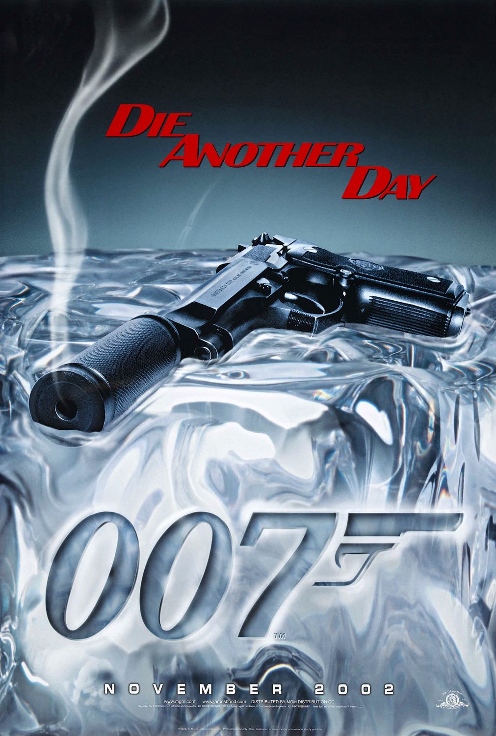
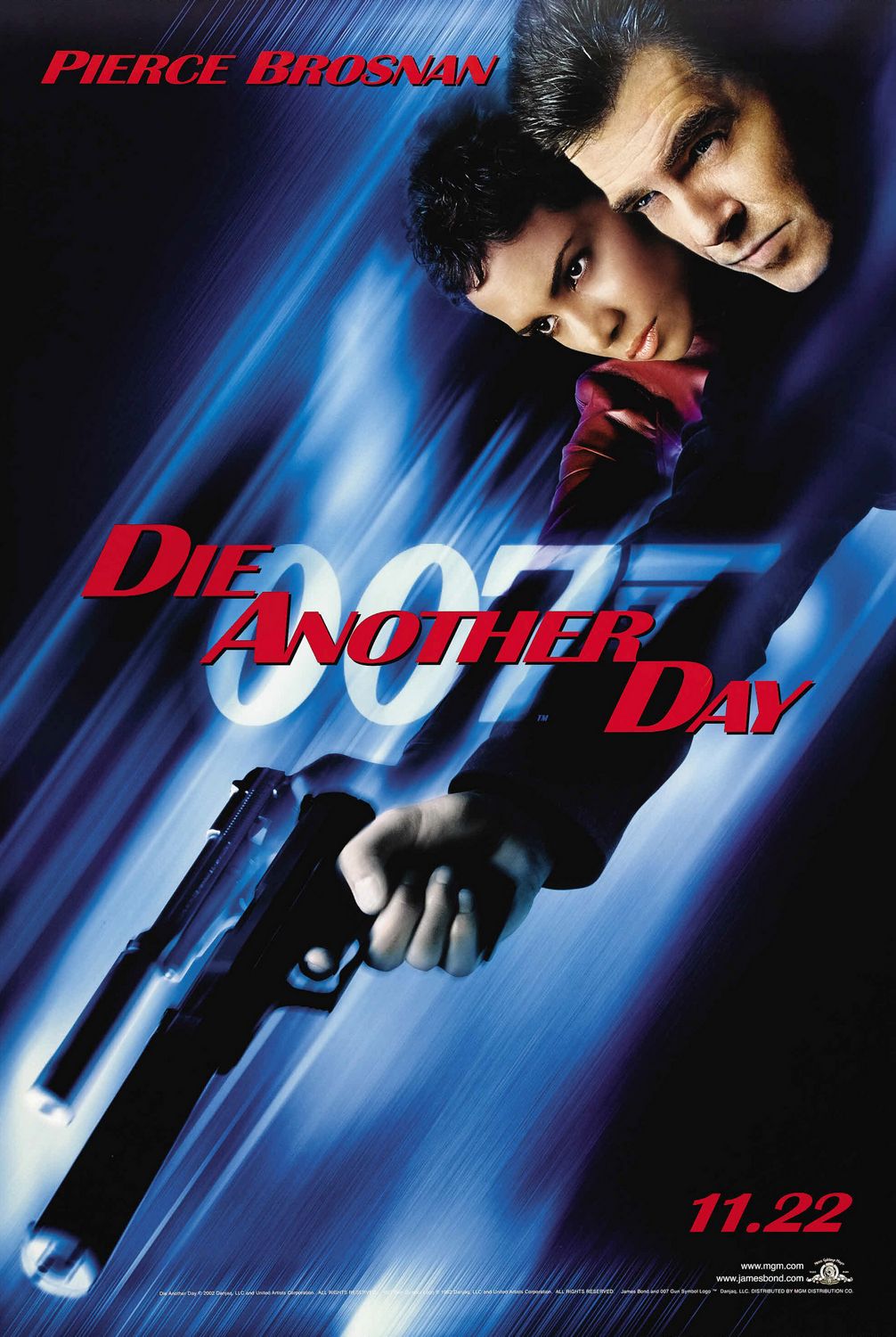
2002 ~ Die Another Day
.
Those of a rude disposition may say Die Another Day’s first ‘smoking gun’-themed teaser (left) was a ‘smoking gun’ for the movie to come, arguably the worst and certainly the most ridiculous Bond film for up to 30 years, but I shan’t be so rude. For me, although it may not be up to the quality of GoldenEye or The World Is Not Enough’s advance efforts, this poster for Brosnan’s fourth and final frolic as 007 is one for which I have a soft spot. The cool, sleek silencer-attached Walther pistol is always synonymous with Bond and it, smoking and therefore hot as it would be, melting the top of some kind of giant ice cube there doesn’t just suggest the vaguely bizarre exotic of the cinematic 007, but also stylishly sets the audience up for the fact this adventure will very much feature a wintry ‘cold’ location (Iceland, to be exact). Conversely, the follow-up teaser poster (right) proved to be the movie’s true ‘smoking gun’ highlighting, as it does, the filmmakers’ desire to (sort of?) headline Halle Berry’s ill-conceived NSA agent Bond Girl alongside The Brozzer’s Bond – notice how her gun-wielding pose and stern expression exactly echo his. In short, this pretty much suggests there’s a Bond film on the way of which to be wary.
.
.
.
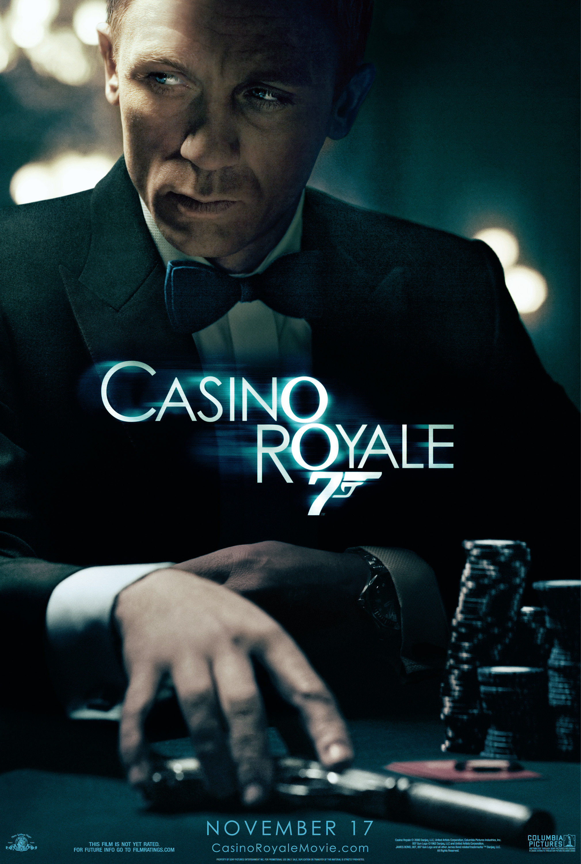
2006 ~ Casino Royale
.
The casting of Daniel Craig as the the post-9/11 Bond indicated one of the biggest changes in direction Eon would ever take, as did the announcement his debut in the role would be a more-or-less faithful adaptation of Fleming’s first novel, the dark and downbeat Casino Royale. In a move to underline these facts then, the very first poster of the Craig era, the above teaser, is one quite unlike any previous effort. Stressing the moodier, harder-edged tone, even hinting at the complex storytelling of the upcoming movie, it communicates with us the undeniable fact Casino Royale will be a thriller; the image’s muted colours and lugubrious blue wash even lending it a melancholic, period film noir feel. Yet the featuring of the new 007 dressed in a black tux in the familiar environs of a casino as he reaches for his trusty pistol (what danger is it he senses?) confirms too this unquestionably will be a James Bond film.
.
.
.
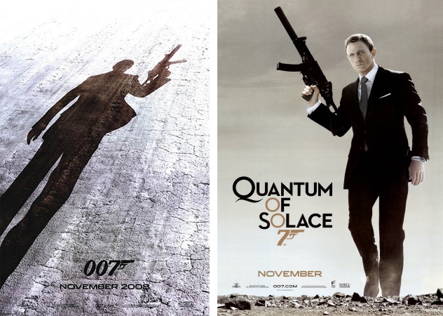
2008 ~ Quantum Of Solace
.
The teasers for Royale’s sequel Quantum Of Solace said less of what was to come in their movie than did the teaser for the former flick – but, one might argue, like Tomorrow Never Dies’ teaser following GoldenEye’s, they didn’t necessarily need to. Again, like Tomorrow, Quantum is a movie all about consolidation; a new direction, a new Bond and sating an audience wanting more of that. So much so that both Quantum teasers echo the final scene from Royale – 007 holding aloft a bloody big gun having finally got the best of an elusive baddie and having finally ‘become Bond’. In doing this, the best of the two is the first (left), which whets our appetite by merely showing us the silhouette of Bond with his gun on a hard, broken (back)ground. The second – and later – poster (right) repeats the theme, this time with our hero walking towards us and alongside it the film’s title in its official typeface (which, again, echoes that used for Royale). So, effective? Yes, both are. But a bit one-note and underwhelming like their movie? Again, yes. Really, its a pity we didn’t get something more original like this fan art attempt.
.
.
.
2012 ~ Skyfall
.
A lot was riding on the shoulders of Skyfall. Not least was it the first time Bond had been on the big screen after another several-year gap, it also followed the (generally considered) too-sombre-for-Bond Quantum Of Solace and thus had its makers promising a return to the ‘Classic Bond’ feel of old. Oh, and there was the little matter of it coming out in the 50th year of the Eon series – it would thus be forever after recognised as the golden anniversary Bond movie. In which case, every pre-release move made by Eon was scrutinised, discussed and cogitated by the mass media and fan base with an intensity stronger than for any previous 007 flick, and that ensured its teaser poster was genuinely a big deal. In this scenario, almost any teaser poster was maybe going to be anti-climactic (surely not everyone would universally love it?), but to be fair, few Bond fans loved the one put out for Skyfall (above). On one level, yes, it advertises the film adequately, but on another it simply underwhelms. A rather blandly dressed Bond with a rather bland expression walking towards us out of a bland looking gunbarrel? Hardly setting the, ahem, Skyfall house on fire, is it? Not least because the whole thing is given that neutral grey wash. And what’s with that clumsy ‘walkway’ effect emerging from the gunbarrel behind Craig? Even something as simple and easy to conceive as this fan art effort would have been better.
.
.
.
2015 ~ SPECTRE
.
And so here we are, right up to the modern day and the next Bond film, SPECTRE – to be released this November. And what teaser poster has been unleashed on us to promote its coming? Well, as they often have been in the past (which I hope I’ve proved), Eon have been canny. For, the first teaser poster they gave the waiting, baited-breathed world, in the wake of the announcement of the flick’s title and reveal of its cast, wasn’t even supposedly a teaser poster. Because, yes, this poster (left) found its way online just moments after a ‘motion poster’ (a clever film-title-revealing video animation) was seen by all and sundry during Eon’s live stream of the official SPECTRE title/ cast reveal event. In which case, the question of whether it’s artistically any good may be moot, because it works very nicely as part of a wider, very specific campaign – reminding us, as it does, of the motion poster, which wonderfully informs us of the title and eerily suggests the rise of the new SPECTRE villain organisation via its animation of the classic SPECTRE octopus logo being created by a bullet hole cracking icy/ frosted glass. However, like Skyfall’s equivalent, the recently released official teaser poster (right) hasn’t been received fantastically well – indeed, for right or wrong, the particular togs in which Craig is outfitted have drawn inevitable comparisons to Roger Moore’s look in the climax to Live And Let Die. No question, it lacks imagination, wit and playfulness, but then most teaser posters – indeed, posters of all kinds – for (so called) Hollywood blockbusters nowadays do, sadly. One thing we can reassure ourselves with, though, is that SPECTRE’s just released teaser trailer surely doesn’t disappoint. Does it…?